Search and Shop experience for Microsoft.com
Redesign of the search and shopping experience for the Microsoft.com e-commerce store from the ground up to improve the findability of products, services, and information.
Role: UX Design
Year: 2022-2023
Client: Microsoft

The Goal
Redesign the Microsoft.com search and shopping experience to improve the findability of products, services, and information
My role
I was the designer for the project working with the team lead, as well as a project manager and copywriter. Also partnered with cross-departmental collaborators from business, merchandising, engineering, and experimentation.
Why redesign search and shop?
The reasons were numerous:
- Customers who search are 6 times more like to convert than those who don't search, thus making search a crucial utility on the site.
- Many search results were hidden behind a secondary 'Shop' tab (default was 'Explore'), where there was only about a 3.4% clickedthrough.
- Overall users have fewer features when searching vs. when browsing for a product
- Products were displayed with only text and were undiscernable from other types of search results, so it was difficult to quickly find a product you were looking for.
- The large promos at the top were being perceived as banners.
- On the Shop tab, the filters were too broad to be useful.
- Results were largely text based, no media thumbnails or file types shown.
- Too many clicks to get to where you wanted.
- Often difficult to browse without starting journey over.
- Results don’t always return as expected.
Understanding the business requirements and thinking holistically

One of the first steps was to review the existing business requirements that the stakeholder team had put together. This was comprised of very specific critera they agreed would make for a great search product. While it contained a wealth of information, many parts were often too prescriptive for this stage in the process. These requirements were of course taken into account and would influence the direction, but it was important to design a solution that would not be unncessarily constrained.
Analyzing competitors ...though there's nothing quite like us
I conducted a competitive audit of search pages and autosuggest features from over 15 websites. While this helped us inform what benchmarks were, something to note was that there weren't any other sites quite like Microsoft.com. While many of these were very e-commerce centric, Microsoft.com was multifaceted: it was part online retailer, part software hub, part games hub, part media hub, and part information hub. The use cases on the site were plenty. So while the competitive audit helped inform our designs, none were quite like ours.


Putting our heads together—a design thinking workshop
I helped plan the workshop, facilitated one of the breakout groups, I synthesized the results, I created deck for presentation to stakeholders. The main takeaways from the results were 3 principles.
The first exercise was to imagine what search would be like if it was a personal assistast exercise. We did an affinity mapping exercise with the stakeholder group to hear ideas.

The ideas were collected and grouped into 3 general buckets, which shaped the principles for search. They were:
- Simplify everything: Keep it uncluttered and easy to understand.
- Know me: Show me items and information related to my unique circumstances.
- Be proactive: Share things with me I never even knew I wanted or need.
There was also an second exercise where groups picked a Microsoft.com persona and envisioned, without technical contraints, what features or qualities search might have. User scenarios were prepared ahead of time and voted on by the group.

Ideating
Once we had a view of the competitive landscape, requirements of the business, and an understanding of the data, it was time to ideate. Here is where I rapidly sketched out concepts.
[Template Wireframes]
[Autosuggest wireframes]
[Template flow chart]
- I ideated via low-fidelity wireframes to quickly come up with potential solutions. The ones that ultimately made it into the designs were:
- Guidance tiles
- Pills
- Breadcrumbs
- Category (departments) home
- Quick look
- Large cards
- Compare tool accessible from Search
- Relevant filters
- Personlized autosuggest
Going into specifics: product filters
[Show excel sheet of all the filters]
old vs new
Iterating on our designs with heuristic analysis
[Show heuristics analysis recommendation and changes]
Wanting to utilize all resources available, we had an external heuristic analysis conducted on some of our key pages. This allowed us to collect further feedback and ensure fewer stones were left unturned. After the analysis was done, I went through each of the recommendations and folded in the ones that made sense. A good designer utilizes all resources available.
Shop page new features
[Product preview popup]
[Consolidated 'compare' tool'
A flow is only as good as the logic behind it
[Auto suggest logic]:
[Serp Templates logic]:
The final designs
[graphic of SERP]
[graphic of Autosuggest]
[graphic of Shop]
[graphic of Compare]
Success metrics
- Exit rate = decrease
- Subsequent search rate = decrease
- Clickthrough rate on search results = increase
Experimentation
3 experiments were conducted
1. Autosuggest
User can’t understand the different type of links. Hypothesis: Adding section headers will improve clarity to help users make the right next decision. Expected results: Increased CTR and decreased subsequent search rate. + Painpoint: User can’t see potenitally helpful page links in the autosuggest. Instead, users might think they are navigating to a page but instead are re-running a search query. This is adding friction to theuser’s journey and increasing our subsequent search rate numbers. Hypothesis: Adding search result page links to autosuggest will help the user get where they want to go quickly. Expected results: Increased CTR and decreased subsequent search rate.
2. Search engine results page
Test the new SERP page against the current (control). We tested 2 variants, one with, and one without the sidebar tiles.
3. No results page
Looking at the landscape—a comparative analysis
Next, I captured industry benchmark examples of 2FA flows, which would allow me to ideate, test and build onto seemingly proven experiences, as well as look for inspiration and themes.
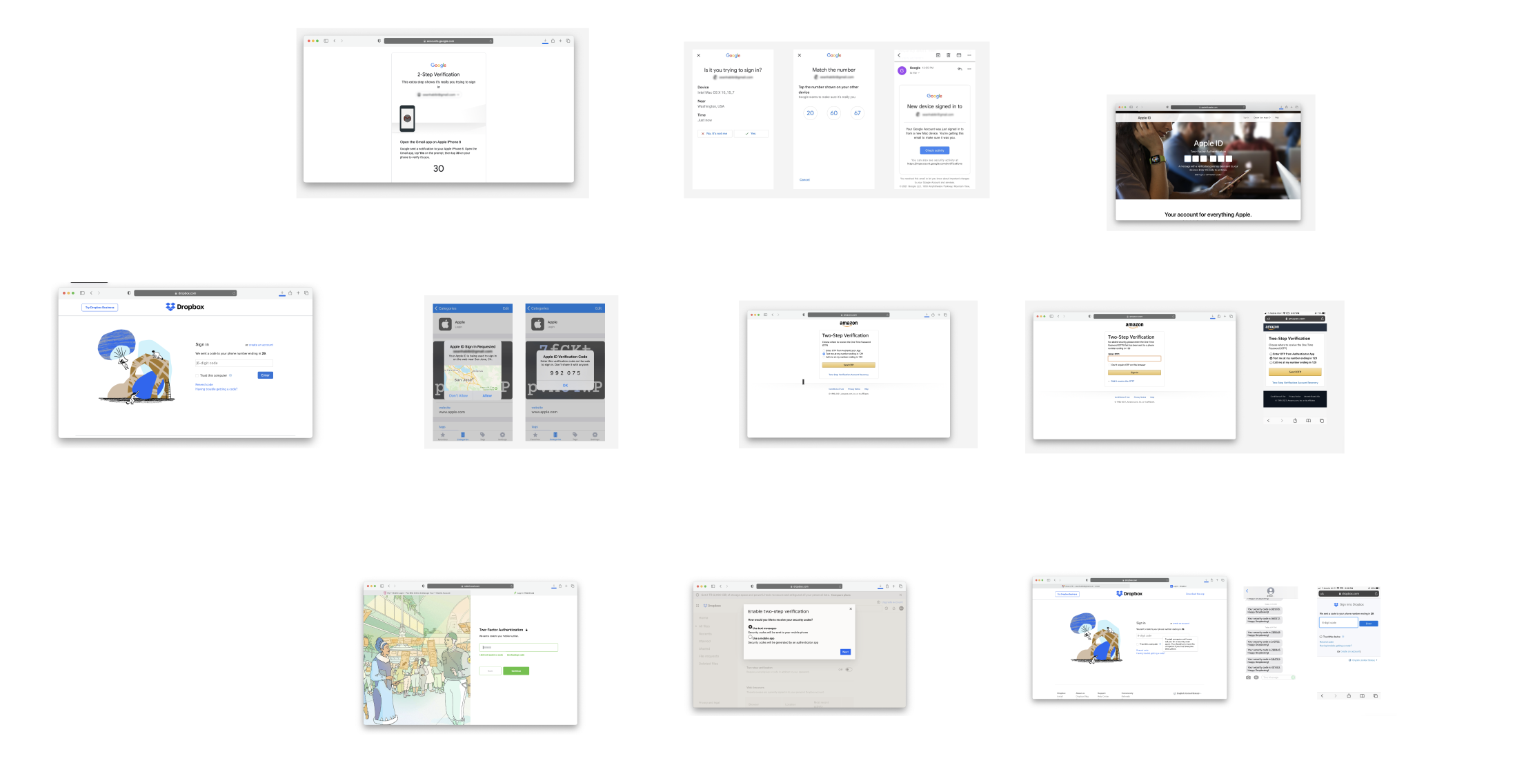
Noted themes:

Some utilized a checkbox.
Some utilized radio buttons.
Some didn't allow for remembering the device.
Some went beyond basic 2FA.
Ultimately, what seemed to be the deciding factor for reviewed interations boiled down to how much security vs. ease they wanted to provide users. For example, on financial related services where privacy and security was of the utmost importance, 2FA methods were often more robust, sometimes not even allowing users to remember a device. Other services were more lax, like with shopping or travel experiences where there would a less of a need for privacy and security, and more of a priority on convenience and ease.
Another interesting theme discovered was that some services (usually the largest companies) allowed users to authenticate with their own internal company apps, allowing users to bypass weaker 2FA methods like SMS text.
So, what do users want?
Next, I wrote a user story to keep the user's point of view in mind, and to be able to refer to it if I ever lost sight of the goal
User story: As a T-Mobile customer, I need a way to easily and securely verify who I am, so that I can access my account.
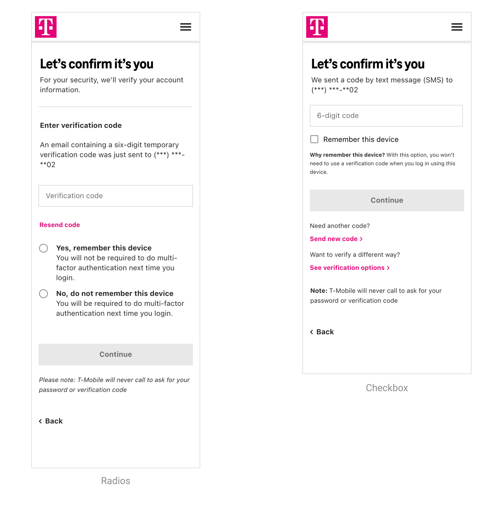
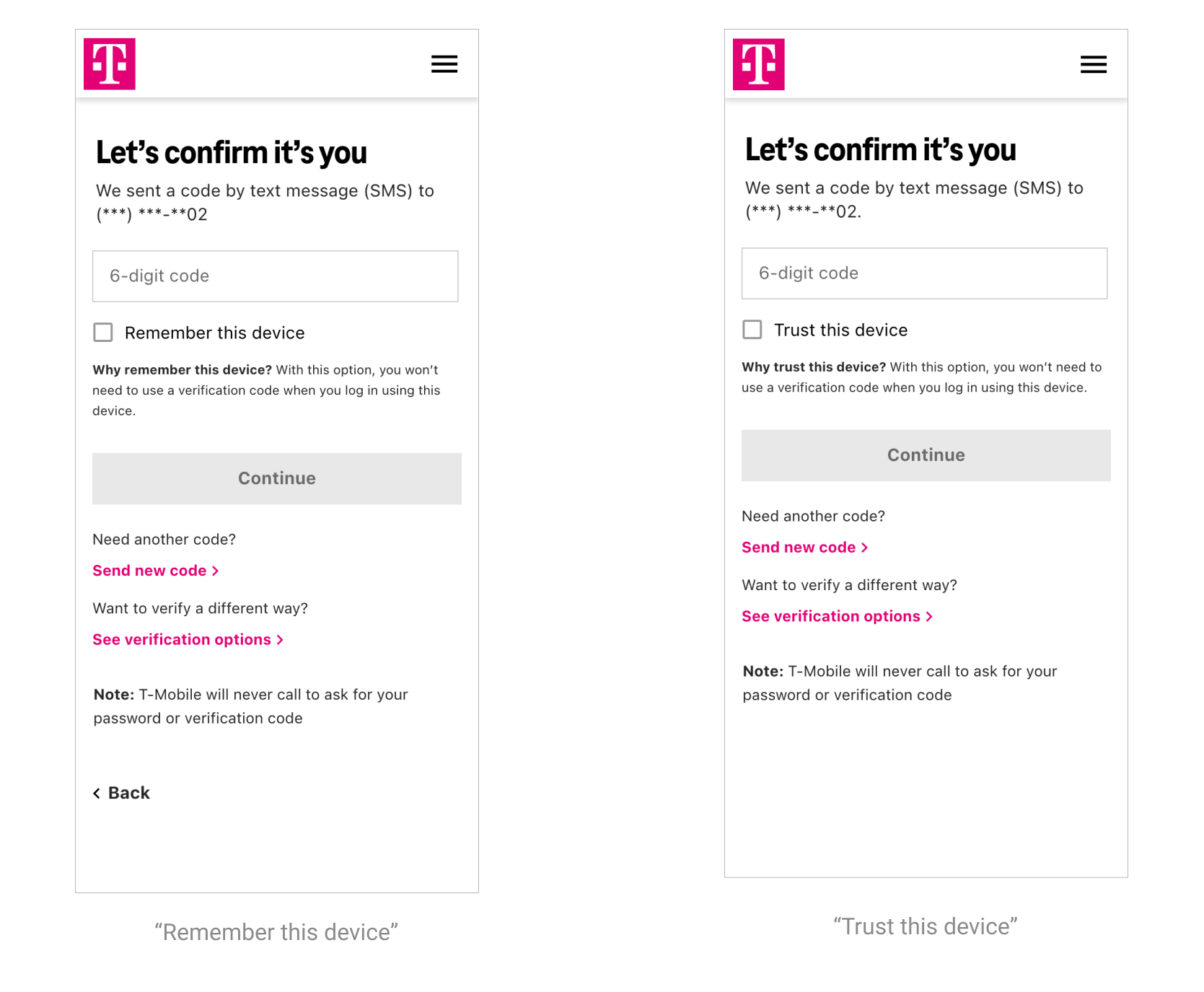
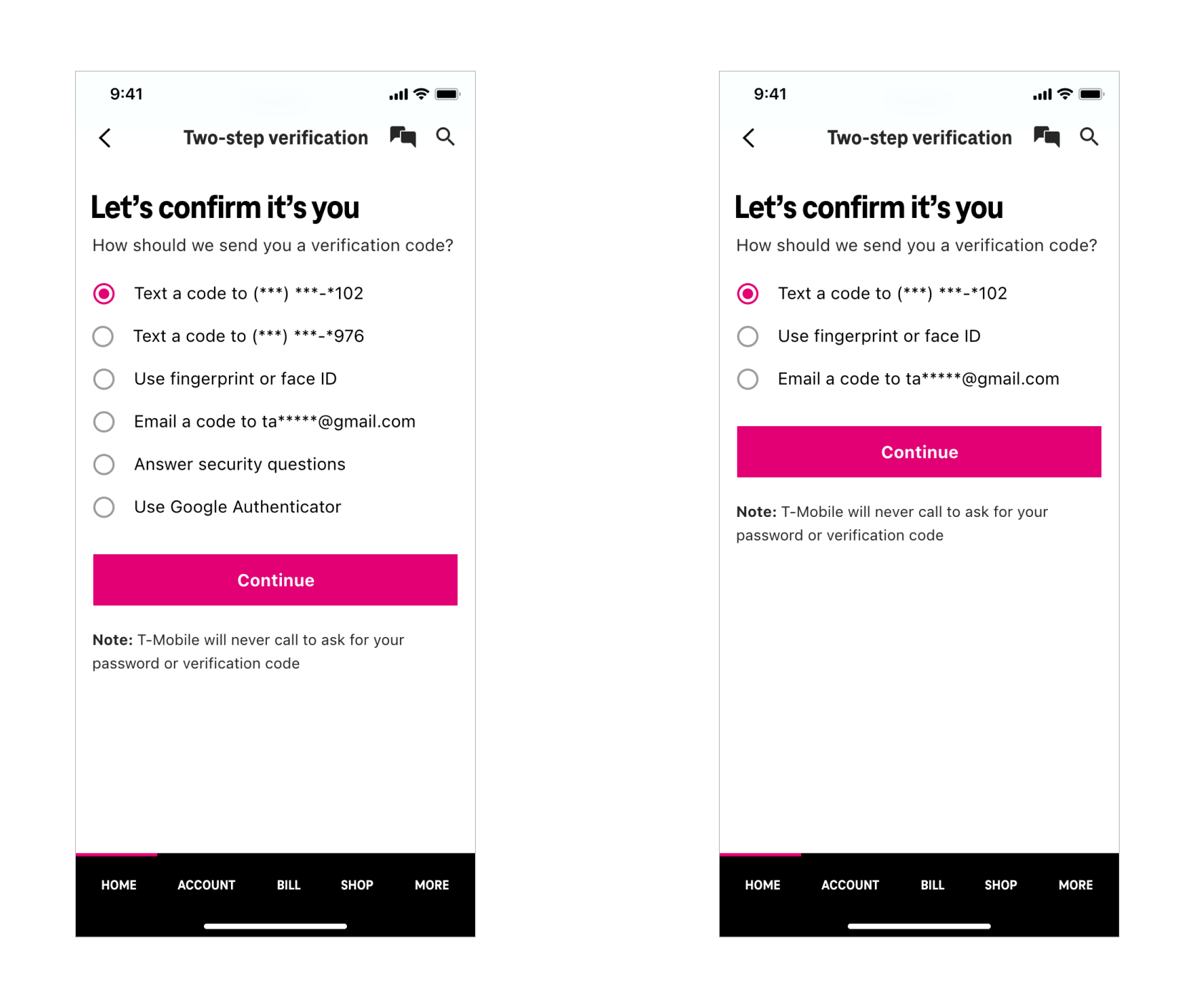
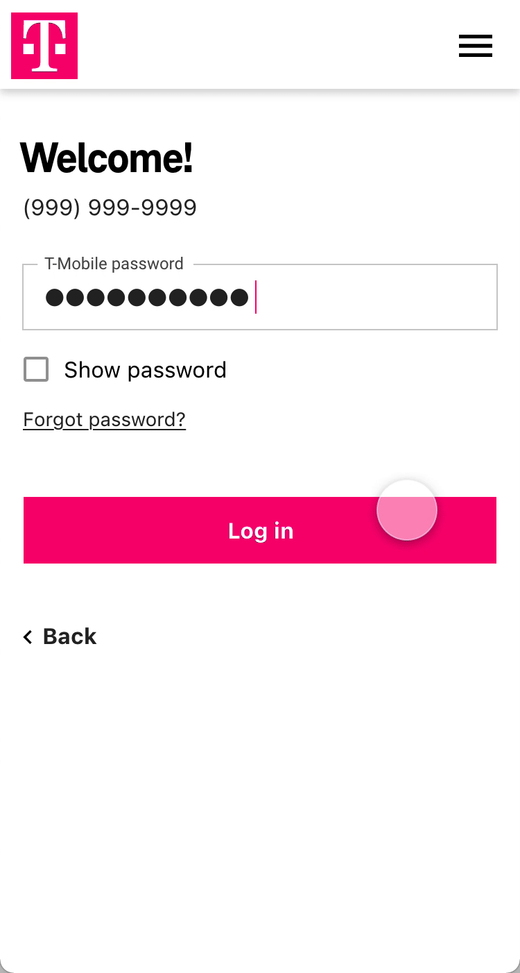
'Remember this device' — radio buttons or checkbox?
The current experience, which utilized radio buttons, forced users to make a choice on whether they wanted to "remember this device." Instead, we explored an alternative using a checkbox, which would aim to reduce cognitive load, friction, and allow users to complete their primary task: signing in. All the while still giving them the same ability to rememeber their device.
“Radio buttons indicate making a choice between options, as checkbox seems to imply you could take no action with it and still proceed.”
What was interesting was that in the small usubility study we conducted (n=15), 60% of participants said they preferred radio buttons, while 40% preferred a checkbox. However, at this small sample size and proportion of responses, both options were still considered acceptable. Ultimately, we felt that the checkbox would serve a subset of users that radio buttons would not (those who wanted to log in, but didn't want to make the additional decision of remembering their device. Radio buttons forced all users to complete the additional step, potentially increasing friction or decision fatigue, espcially when they could be trying to accomplish an important task like paying their bill or purchasing a product.
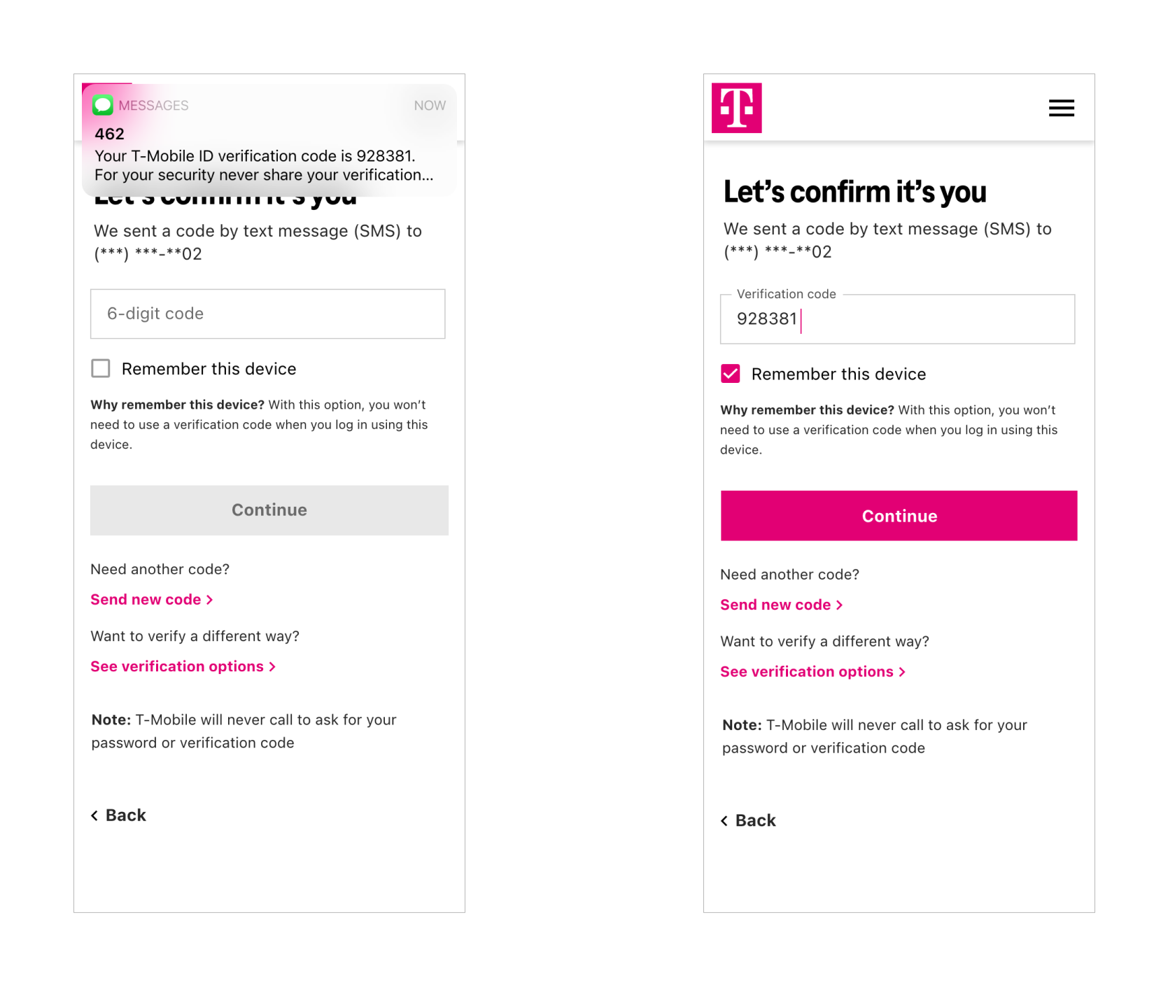
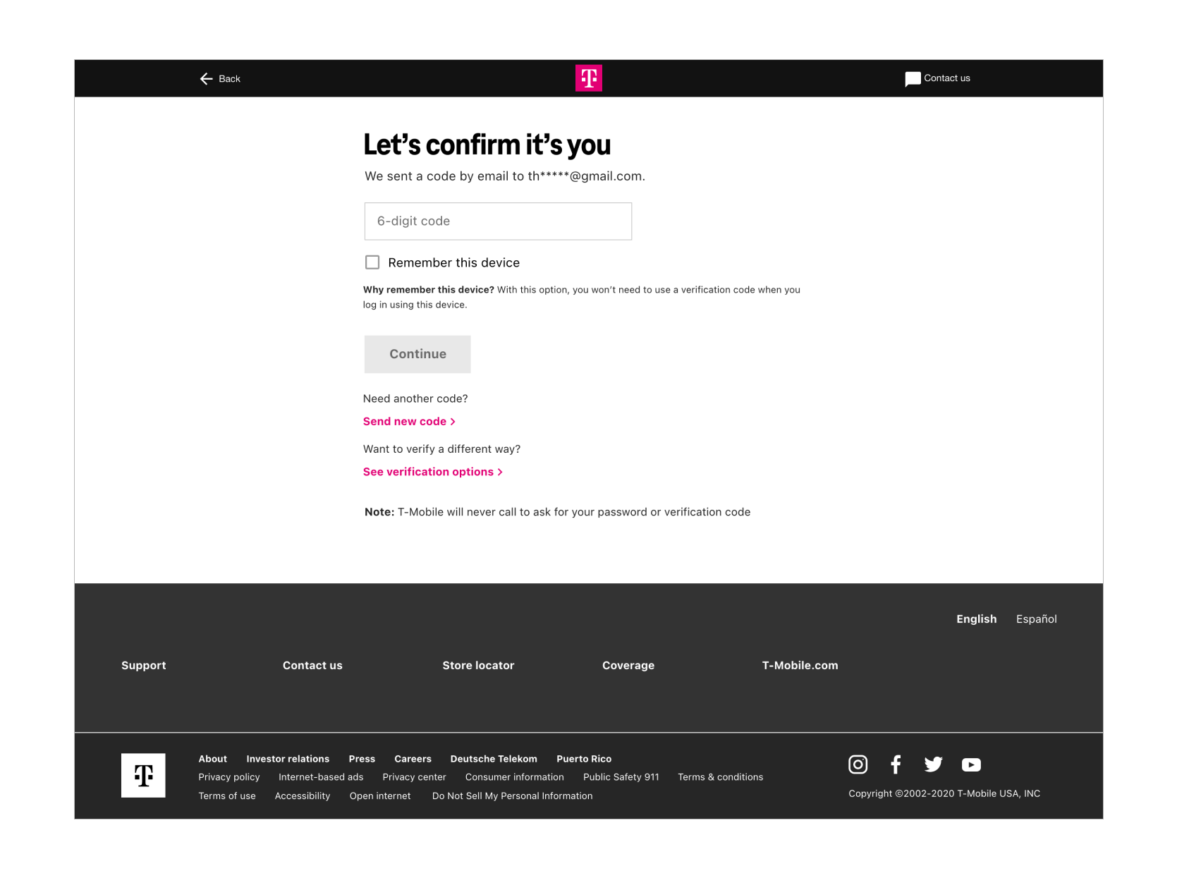
Contextual messaging explaining why users would want to remember their device — on-page or modal?
When testing whether participants preferred an on-page contextual message versus having a button with the message contained inside the modal, 73% preferred the on-page version, and only 27% preferred the modal.
“I don’t want to click a link unnecessarily. I feel it is not trustable. I might end up deleting the app as it is very fish.”
“Trust this device and then the words ‘What’s this?’ Is not an acceptable option. I feel annoyed to see that question.”
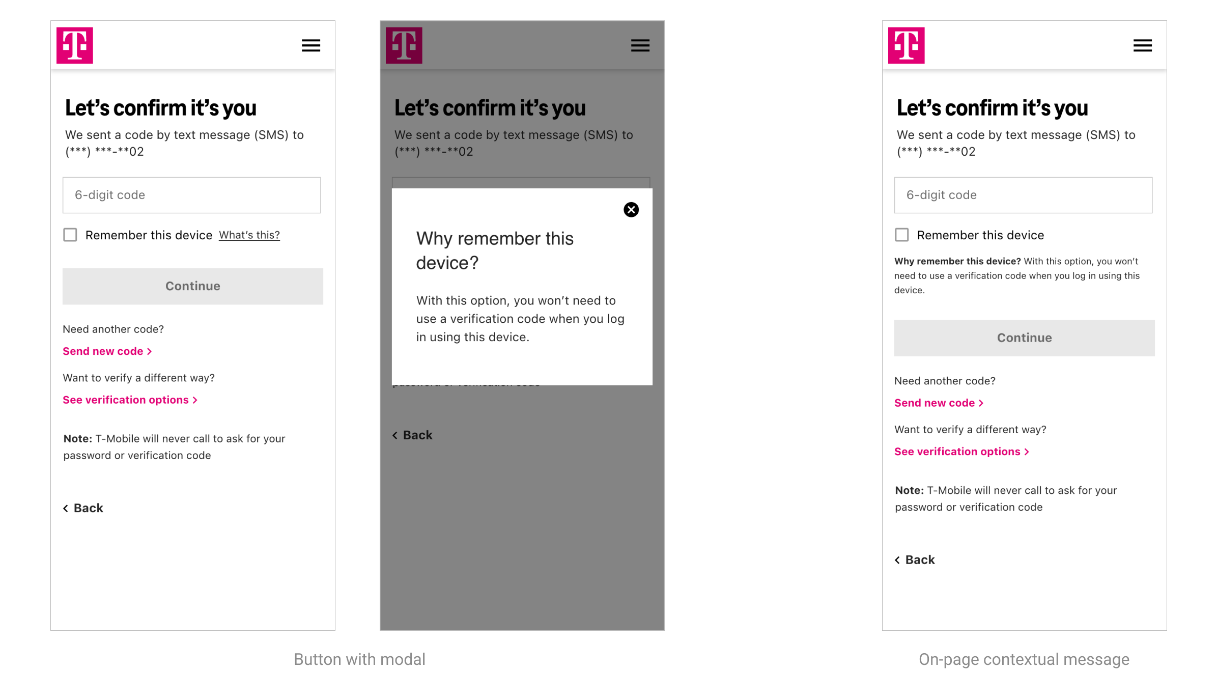
Ultimately, while the modal would offer a cleaner experience with much fewer words on the screen, it would likely mean most users would not ever click through to read the message. Looking back, I would've also liked to see how a checkbox vs. no message at all would've performed.
Copy: 'Remember' or 'Trust' this device?
We also wanted to test different copy we were seeing in industry benchmarks. Our hypothesis was that "Remember" would be more preferred because it was more specific about the function of feature, whereas "Trust" could hold meaning beyond its specific intent, that could turn users away from selecting it. With data breaches being so commonplace, do people really trust their digital services? The results of the user study confirmed more participants preferred "Remember this device" (73%) to "Trust this device" (27%). And though the study sample size was not large enough to say this with certainly, we felt confident enough in this decision.
“'Remember this device' is a low security compromise which makes access to my account smoother and faster.”
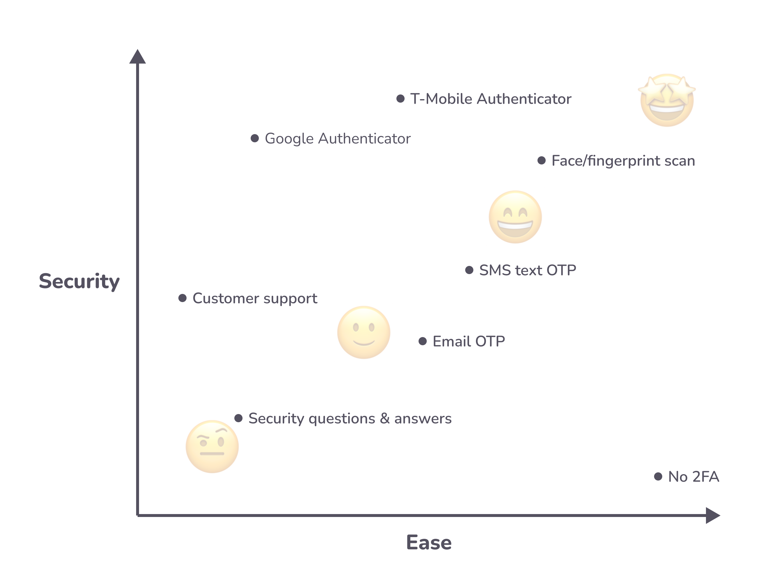
Ordering of options: participant preferences
We based the ordering of options on both users' preference and level of security. Text message was by far the most preferred (but not necessarily the most secure) so we placed it first. Biometric login (fingerprint of face scan) is one of the more secure methods, so we placed it second.
Usability study results
- 58% or greater chose text message
- 21% or greater chose fingerprint or face
- 8% or greater chose security questions
- 8% chose email
- 0% chose Google Authenticator
Security vs. ease
Taking a look at T-Mobile's available authentication methods, we evaluated each in terms of security and ease taking into account feedback from the digital security team, participant responses and heuristic evaluation.
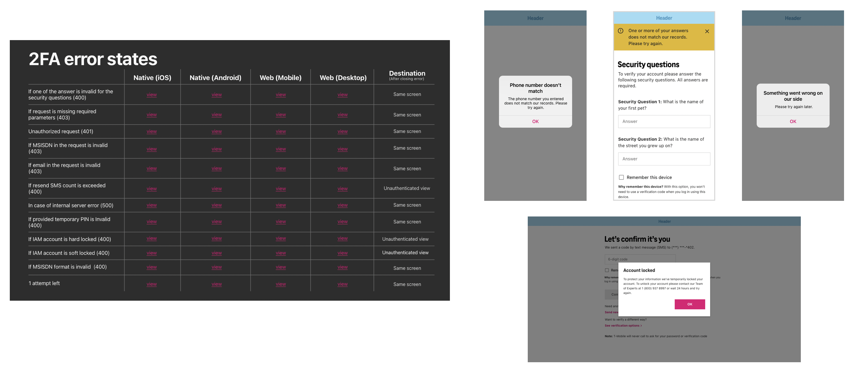
Contextual error states, helping guide users
Additionally, error states had to be re-examined and rewritten as many were overly technical and contained jargon that typical users would be unfamiliar with. In total there were 12 error messages for 4 device sizes (iOS, Android, mobile, desktop), which all had slightly varied copy depending on the component that was to be used.
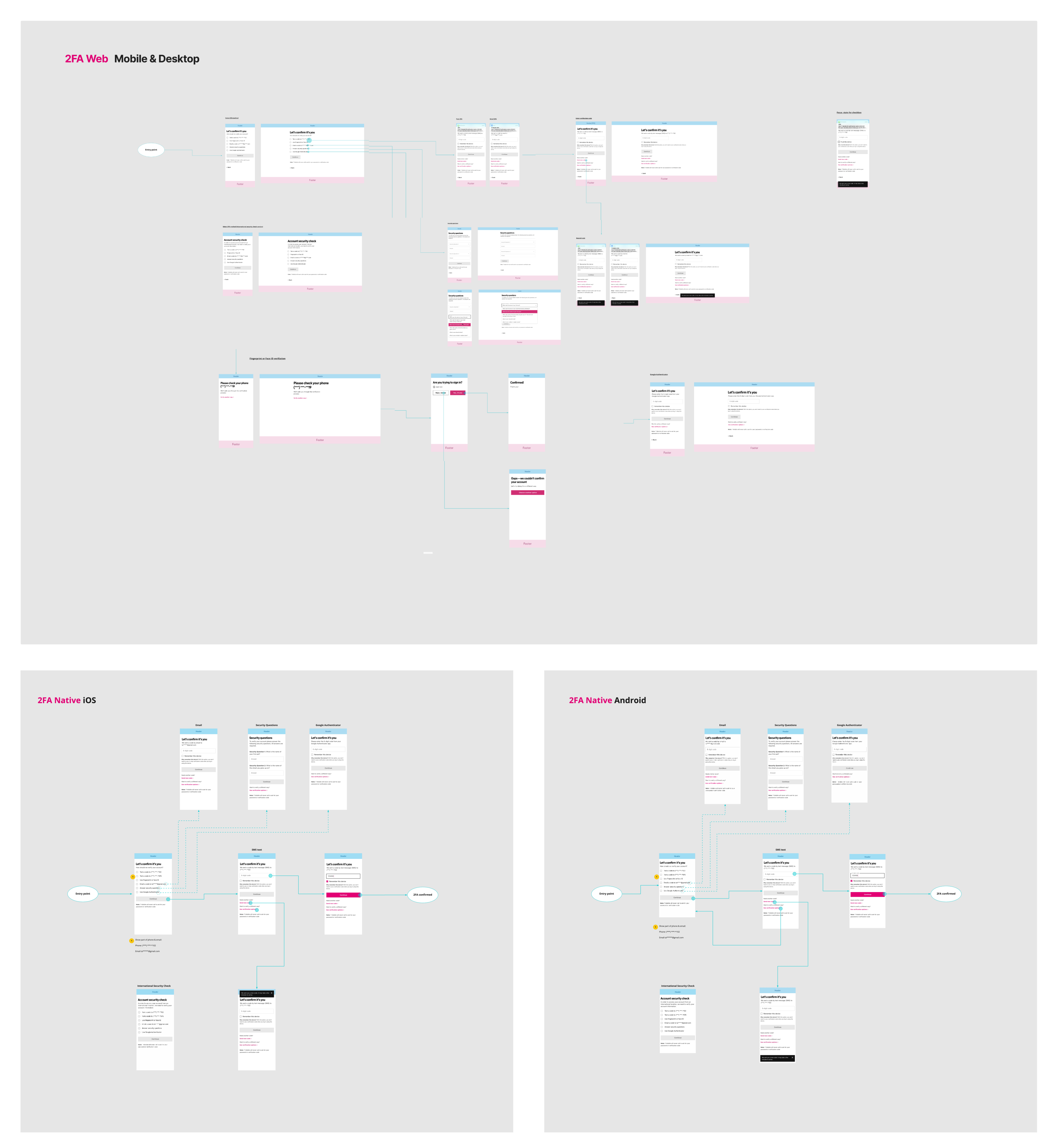
Flows
The handoff included flows mapped out for web (desktop & mobile) and app (iOS & Android), as well as the high-fidelity design files.
Final Designs
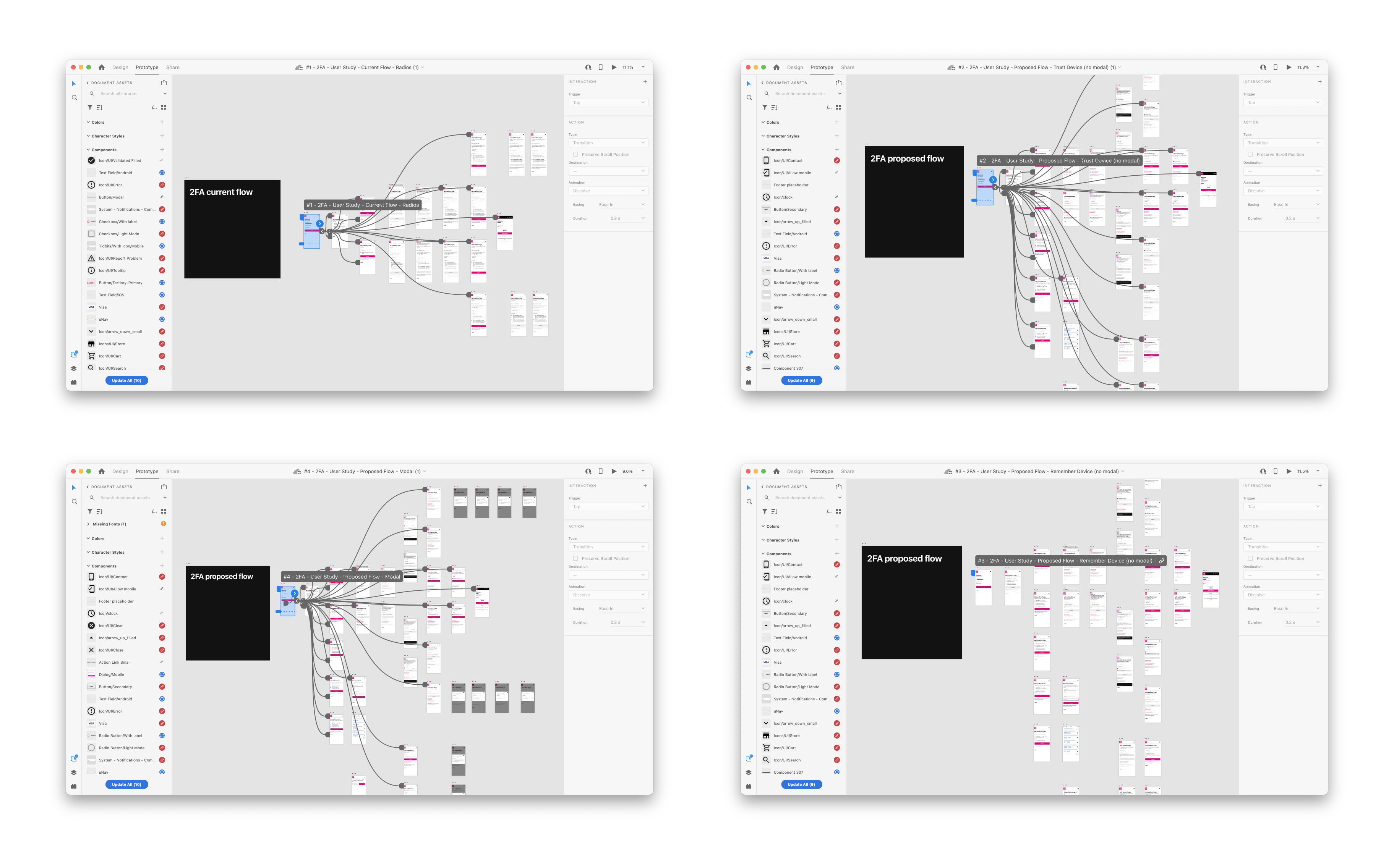
Interactive prototypes for usability testing
I created 4 prototypes for usability testing which included 1 control and 3 proposed design changes. 3 were needed in order to isolate an accurately collect and observe the specific changes we wanted to test.
Key Design Updates
Update style to current design system.
Show partial preview of text/phone number.
Add checkbox to remember devices.
Contextual messaging to explain why users would want to remember their device.
What next?
Ultimately, removing the need for 2FA altogether would greatly improve the user experience. Logging in, while necessary for digital security, interrupts the user from accomplishing their original task—whether that's paying their phone bill, managing their account, adding a line or buying a new device.
Some ideas include:
- A passwordless login, like a one-time pin/button confirming their identity.
- In-app authenticator, where users don't need to download a separate authenticator.
- Inceasing single-factor biometric authentication, which usually has a high enough security level to not require 2FA.