Radio app for NPR member station, KCRW
With over 90k monthly users, the KCRW app allows listeners to hear KCRW's live radio streams, music, news and culture podcasts. The redesigned app makes it easier to access and discover content better than ever before.
Role: UI/UX Design
Year: 2018
Client: KCRW
Goal
Re-design Los Angeles-based public radio station KCRW's music and podcast app for iOS, Android and tablet with the goal of increasing usage, engagement and user experience.
My Role
My role in this project was as both lead designer and producer. I was responsible for garnering buy-in with stakeholders, user research, UI/UX and working with the development team to see through its implementation.
Why redesign the app?
The current app was in need of an overhaul from both a design and development standpoint. It functioned well but did not do a great job of surfacing content beyond the three live radio streams. On demand podcasts were hidden beneath a few taps within the hamburger menu. Moreover, there was nowhere in the app to feature individual episodes -- users would already have to have something in mind.
Additionally, facing increasing competition from other music and podcast apps, making content accessible to listeners has become more important than ever.
The Challenge: Pleasing Existing Users and Designing for New Ones
The main challenge with the redesign was both satisfying the existing userbase, who for the most part, use the app only to access the live radio streams, but also trying to create a richer experience beyond live listening through discovery of on demand podcasts and music shows.
So, how do I teach users to look behind what’s on air and to show them that the app has much more to consume on-demand in the wealth of podcasts and music shows?
The Approach

Our team separated process into four stages that could be easily communicated to stakeholders. This would also serve as milestones to ensure I were sticking to the timeline.
Designing for a Diverse Audience
The first step was to conduct an analysis by pulling as much data as I could, sending out user surveys and interviewing colleagues, volunteers and peers - ultimately using this research to put together a few personas that could be used to guide the design process.
The analytics showed that our audience represented a wide range of people from various socioeconomic backgrounds, education level, gender, location, and other interests. From this data I honed down the persons into four types of listeners, based off architype behaviors and demographic backgrounds of our users.
I sent out an online survey that received 145 responses and asked questions around:
- Device type
- On-demand listening habits
- What users liked/disliked about app
- If they have trouble finding content/features
- What new features they wanted
- Competitor music and podcast app usage
What I found
- Varied listening: on-demand content consumption varied. Anywhere between 1-9 different shows.
- iOS heavy: 99% of respondents listen on iOS, 1% Android (actual data close to 90%, 10% respectively)
- Some are lost: 1/3 respondents reported having difficulties finding something in the app
- Some don't browse: 54% respondents don’t ever open the app without having something in mind already
- Major competing apps music: Spotify (97), KCRW app (95), Apple Music (77), YouTube (74), KCRW website (73), AM/FM radio (70), SoundCloud (49), Pandora (48), Amazon (38), Satellite radio (14), TuneIn(12), iHeartRadio (8), Sonos (7), Google Play Music (4), Other (7)
- Major competing apps in podcasts: Apple Podcast (91), KCRW app (75), KCRW website (55), TuneIn (13), Sonos (8), iHeartRadio (4), Stitcher (10), SoundCloud (12), Spotify (15), Google Play (1), Other (7)
Who are the users?
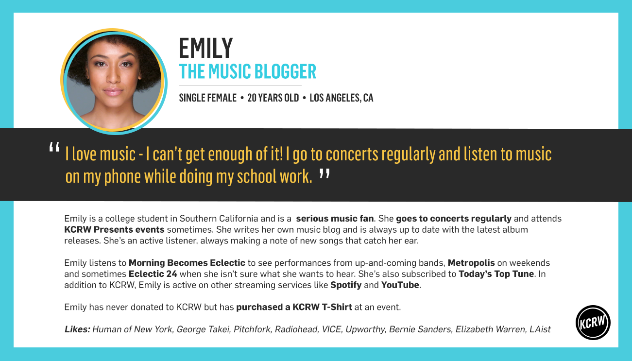
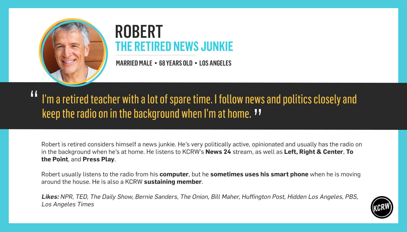
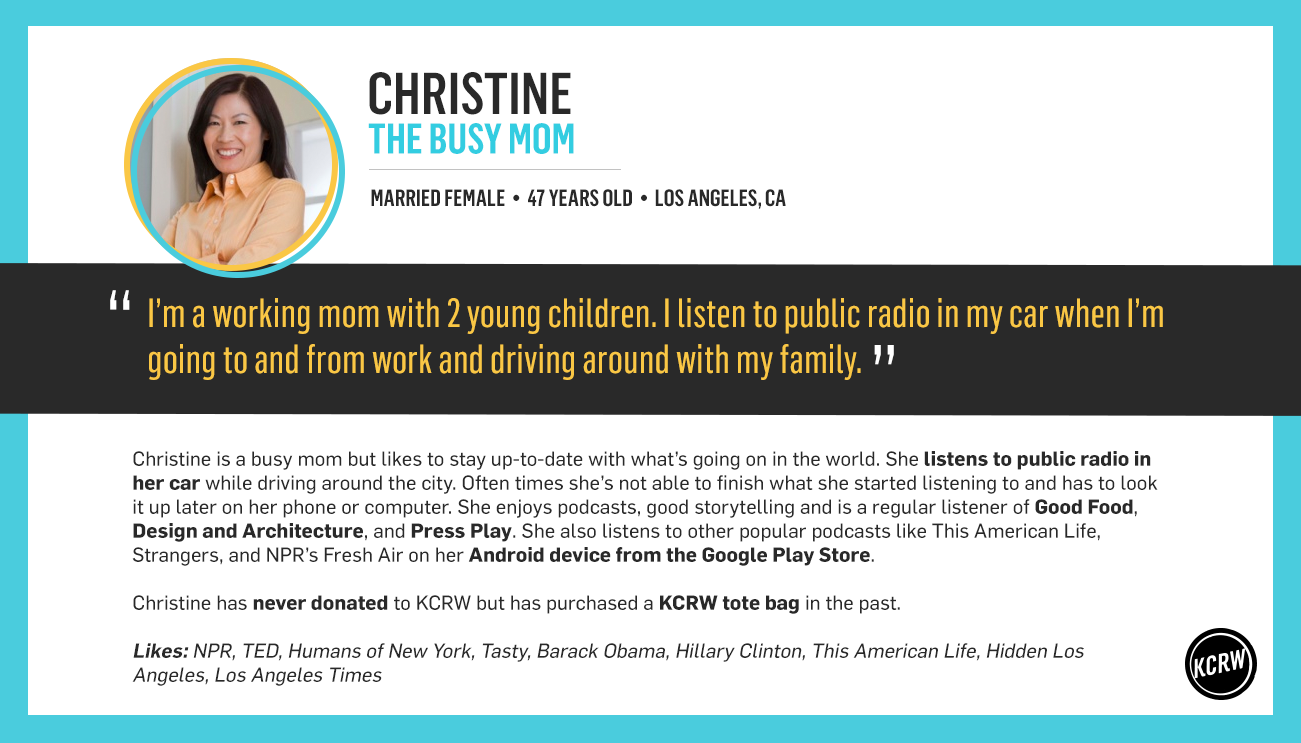

User personas breaking down KCRW's listnership into four different characterizations.
Synthesizing and ideating
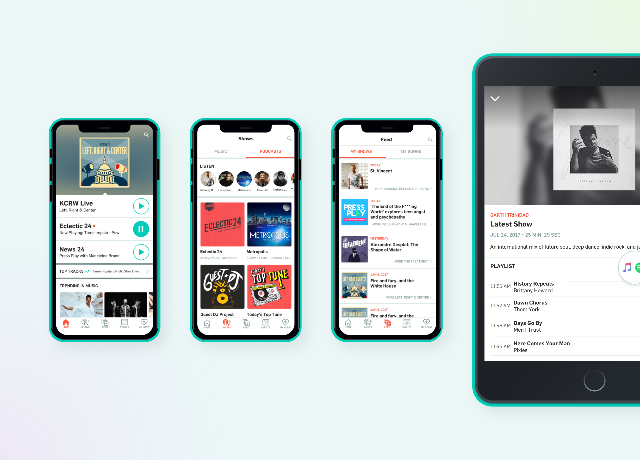
After gathering qualitative and quantitative data, I began laying out the foundation for the app. This entailed a site flow to communicate the structure of the design to stakeholders and developers. I went through a couple iterations but ultimately landed on separating the app into 5 sections: Live, Music, Podcasts, Feed, and My KCRW
There was some debate whether or not the homescreen warranted a more radical change, as I had been interested in exploring, but ultimately I decided not to pursue any drastic changes on the home screen.
Sketching out ideas
After I had a better understanding of user goals and behaviours, and overall structure of the app, I moved onto putting together low-fidelity wireframes. This would help me better visual the user experience and help communicate its progress to stakeholders.
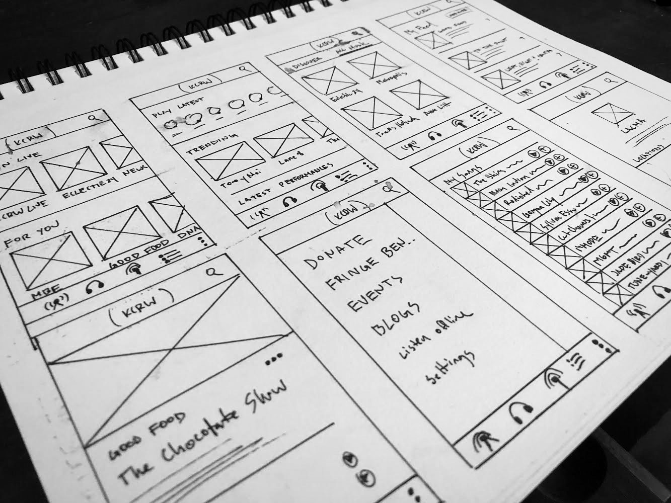
Visualizing the flow
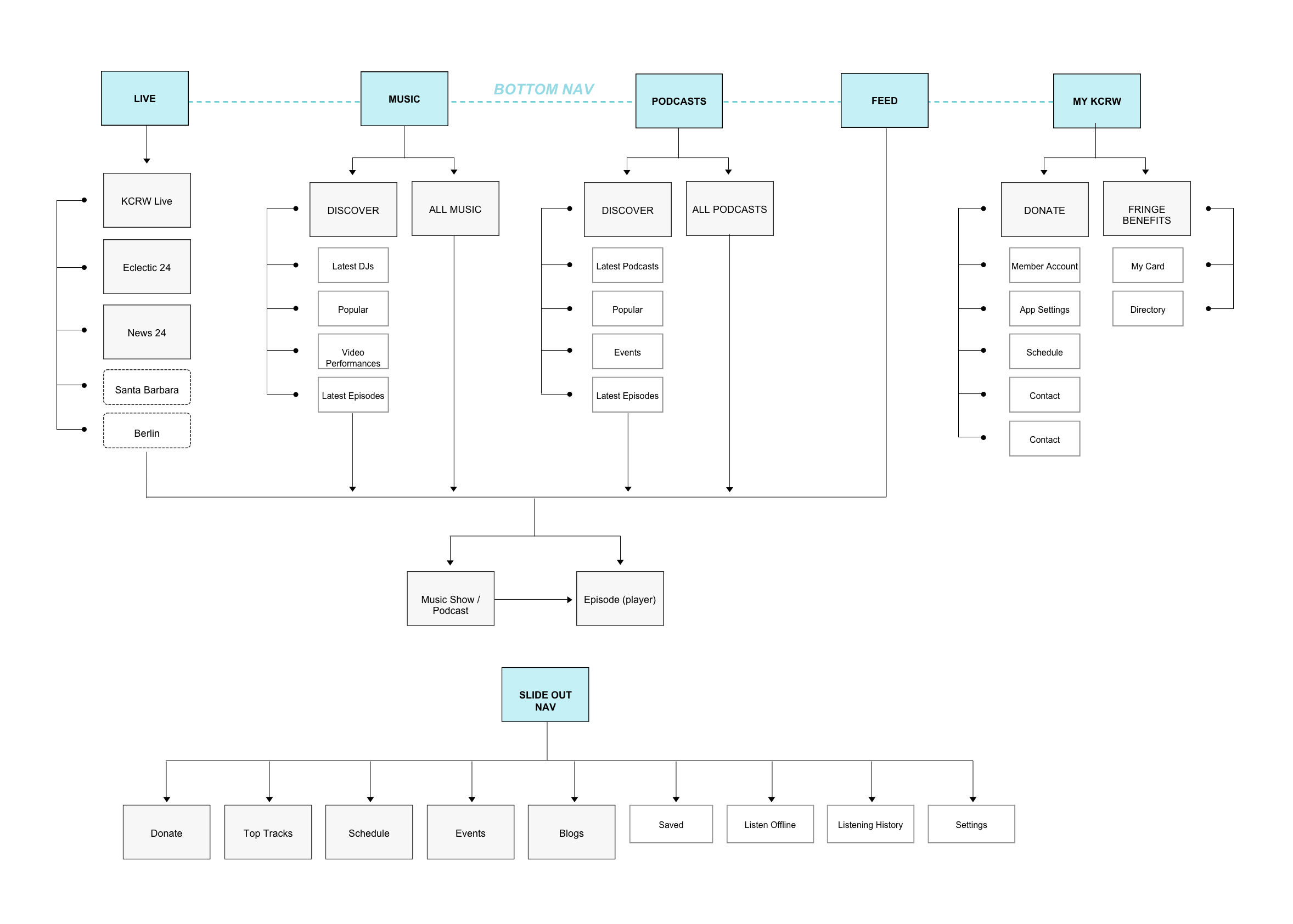
Planning for success
After getting out all our ideas, I digitalized and annotated them so I could better discuss, refer, and share them with stakeholders. This also serves as the starting starting point for the final hand off to engineers.
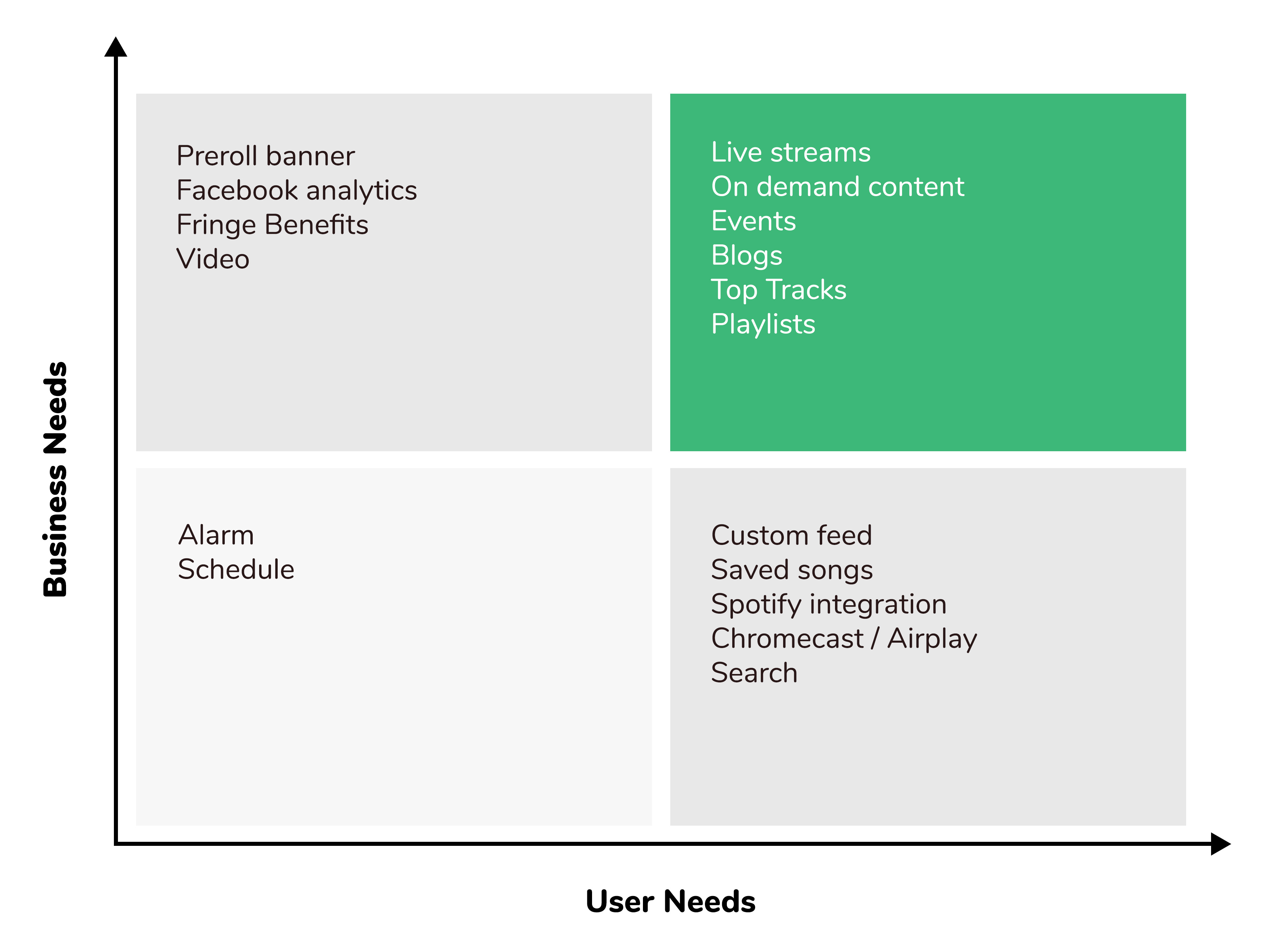
Feature prioritization matrix
Improved Navigation
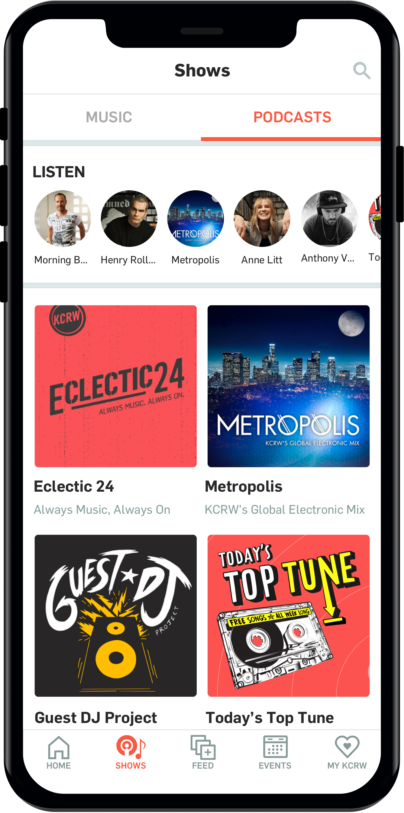
One of the first tasks was to unearth the main sections of the app from the infamous hamburger menu. While putting everything behind a single icon was a tidy solution to organizing the many screens, it did a poor job at teaching new users what the app was all about.
Employing a bottom navigation was a much better solution because it would highlight the main sections of the app on every screen. Navigation is important not only for finding your way around, but also showing users at a glance what they can expect from your product. I'm also a proponent of using establish design patterns whenever possible, as this helps lighten the cognitive load for your users when they have to learn to use a new UI.
I went back and forth with different ways to organize the navigation but ultimately settled on five main sections (Home, Shows, Feed, Events, and My KCRW).
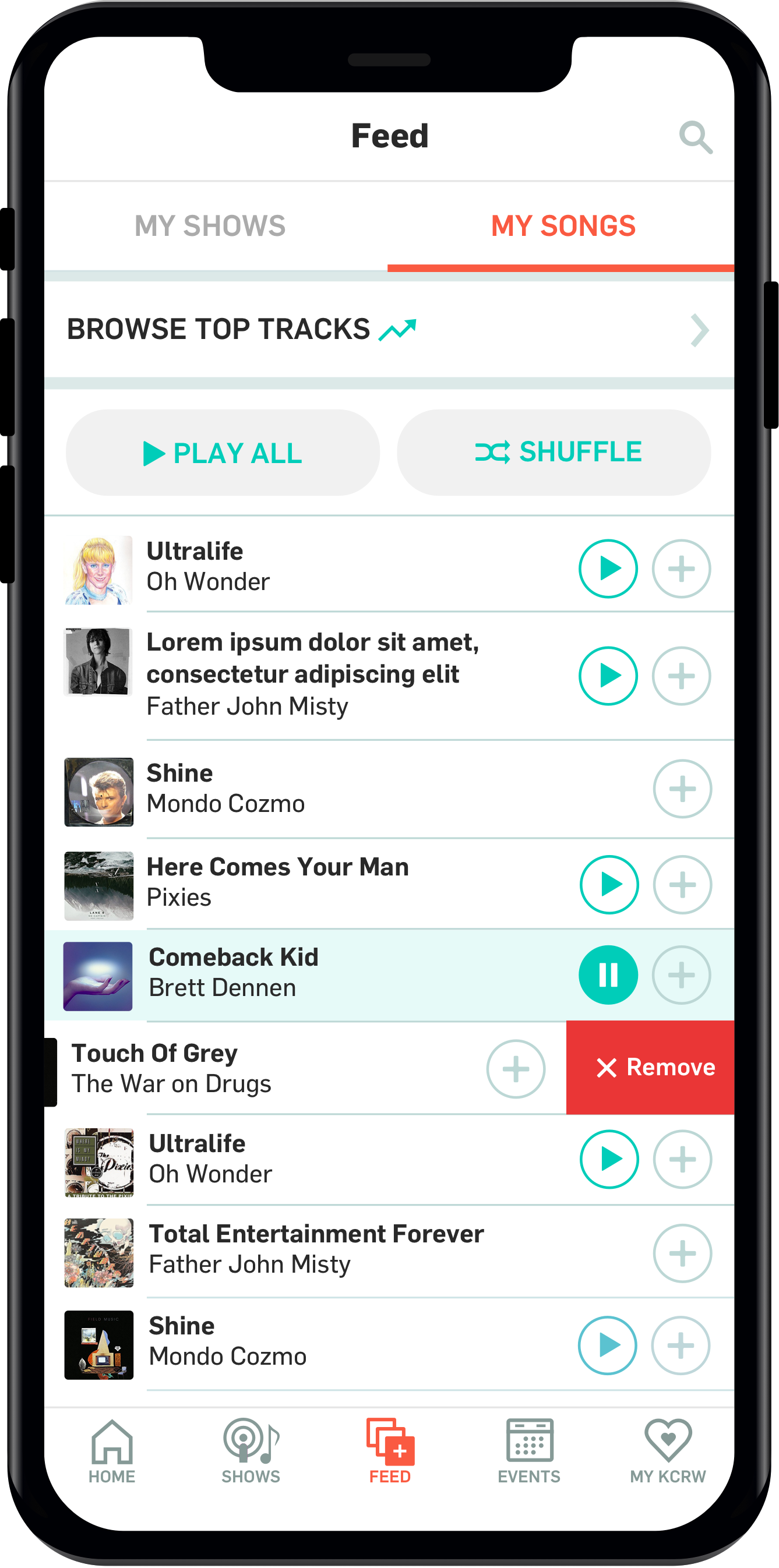
A Personalized Feed
One of my goals was to find ways, with design, to encourage users to frequent the app more often. There are many ways you can do this, for example, through email marketing, notifications, and deep linking web content, but I wanted to make the app more useful for users. By creating a feed, I hoped to give users easy access to consume their favorite podcasts on demand. From the analytics I could see that the majority of app users come to the app for the live radio streams. Behind that there was a significant drop off in on demand content consumption.
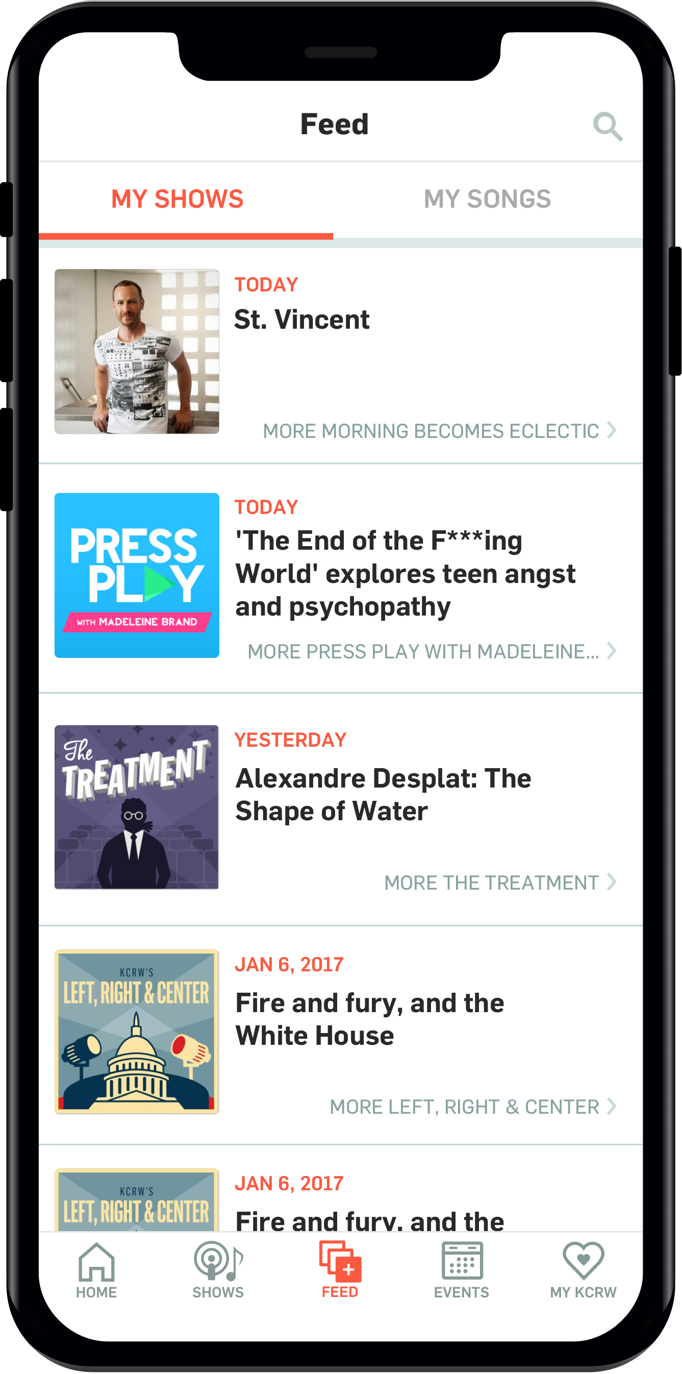
I hoped that by creating a feed KCRW could better compete with big podcasting platforms like Apple Podcast and Google Play, as keeping users in our ecosystem would ultimately serve the organization better.
Shortcut to Latest Shows
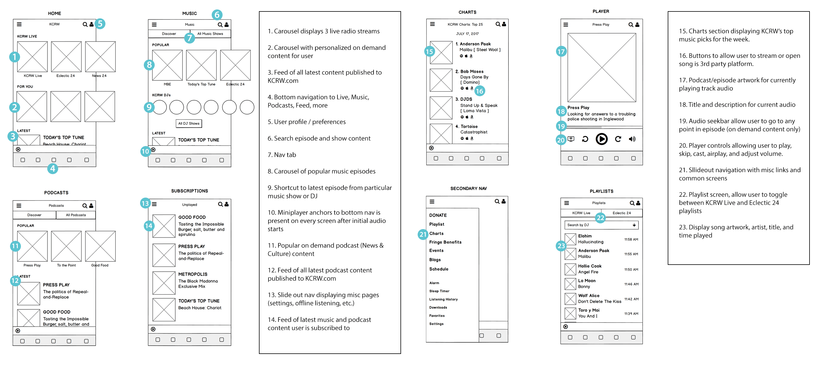
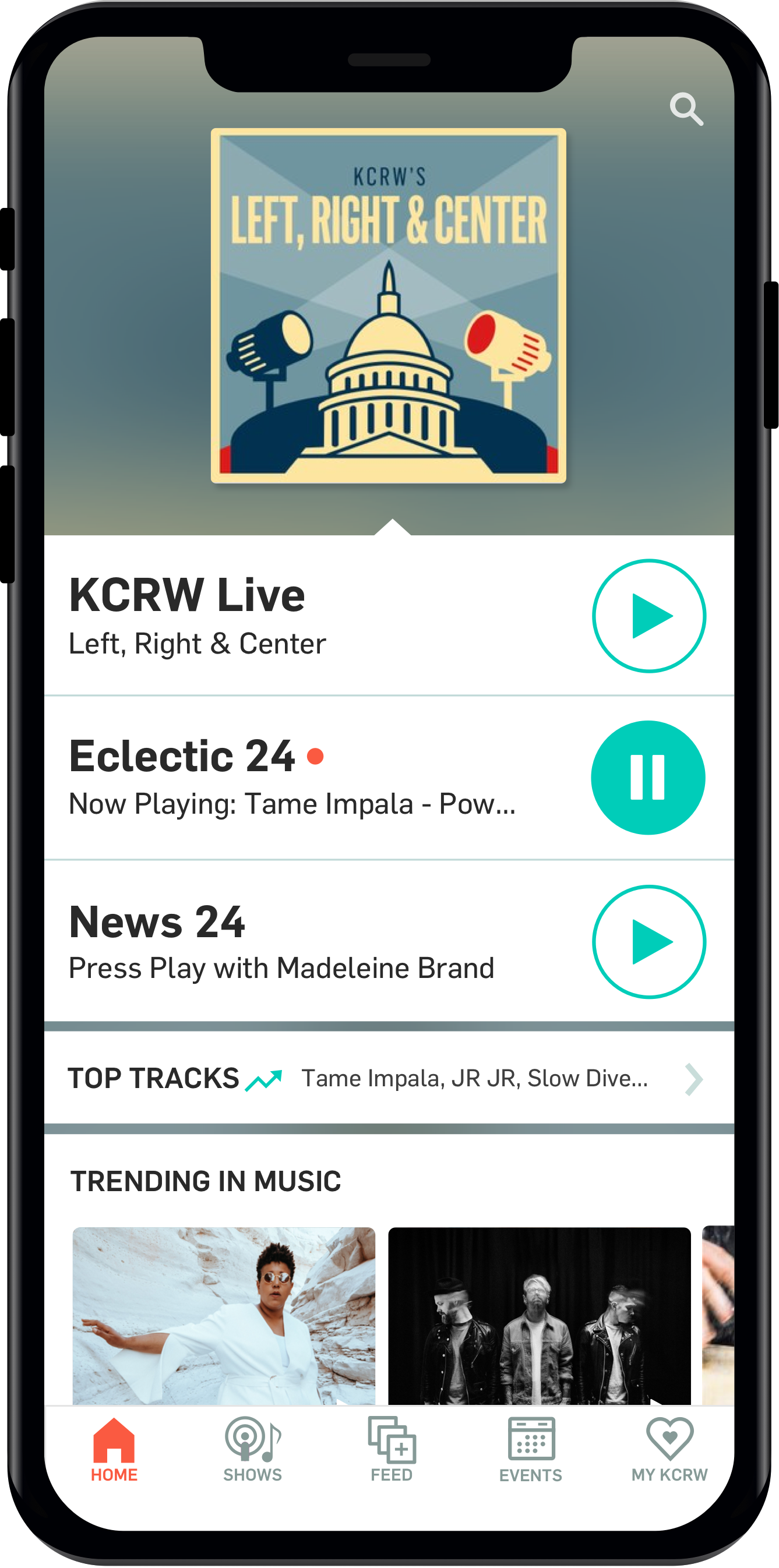
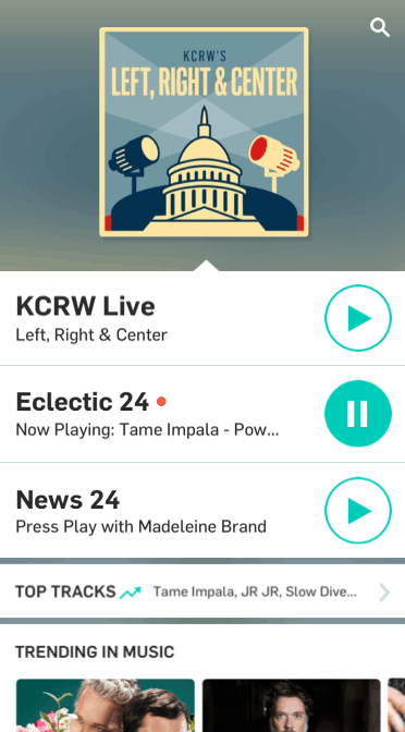
In addition to making it easy for user to find their way around with a bottom navigation, I wanted to reduce the number of taps that it would take to reach a podcast or DJ set. With the previous design, from the home screen it took four taps to get to an episode. With the new UX I was able to bring it down to two by putting users’ most frequently listened to podcasts in a small slider at the top of each main section.
Highlight of Currently Playing
With the redesign I also wanted to make the home screen more dynamic and representative of what was currently on air. People listen to live radio because they trust the curation and they want to know what’s happening in the moment. I brought out the artwork for the currently playing show.
Spotify Streaming and Playlist Adding
Spotify was something I wanted to incorporate as many of our users are music aficionados who dive deep when it comes to listening and saving songs. With the previous design, you could only go as far as adding songs to your saved list. With this new app I’ve made it so users could also add songs to their Spotify playlists, or even stream the song directly (with a Spotify Premium account), all without ever leaving the app.
Rewind Live Radio
Something to give our app a competitive edge and enrich the live listening expereince by allowing users to resume where they left off if they were interrupted by a phone call or simply wanted to listen again to something they missed.
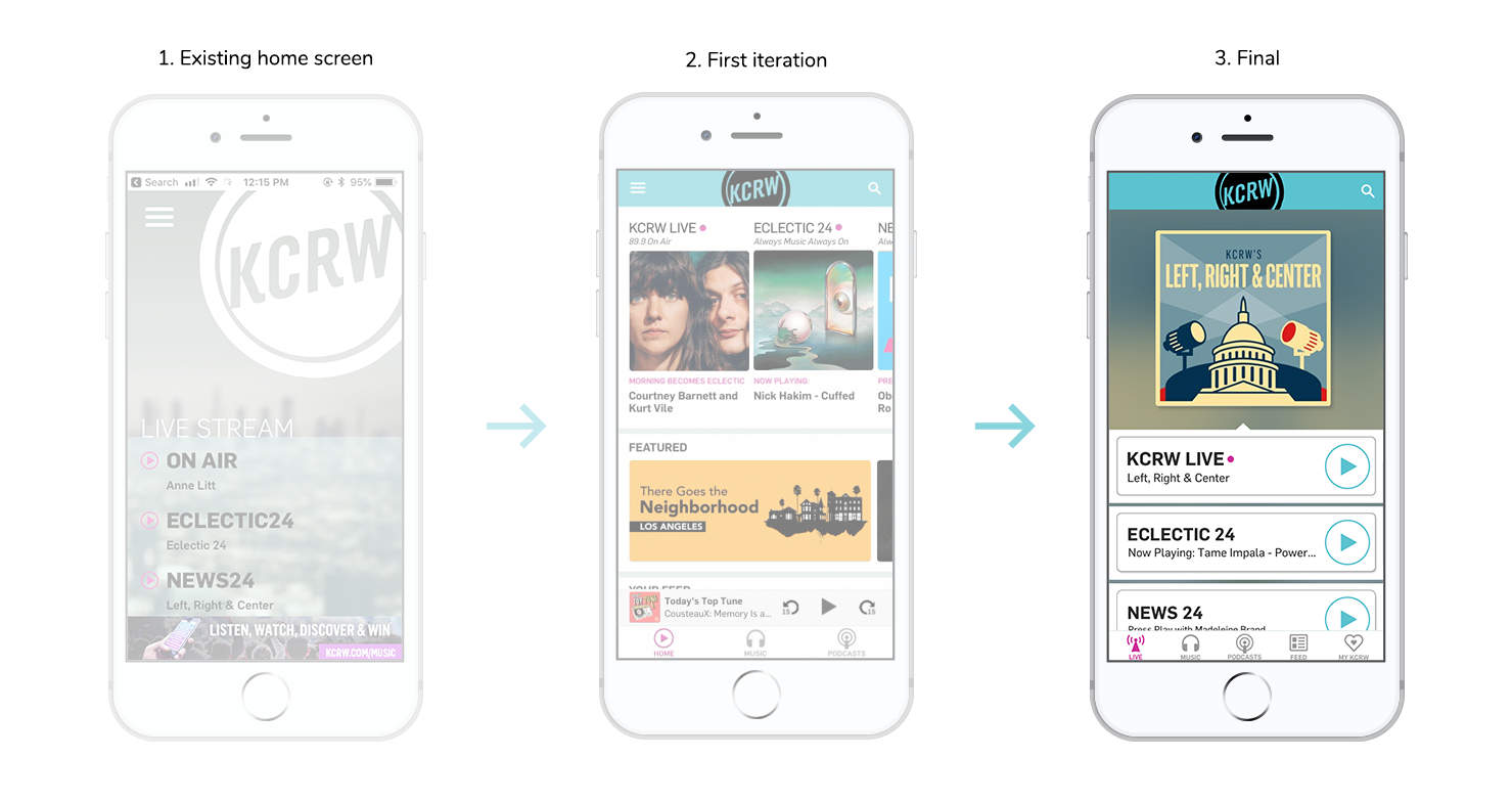
Iteration of the home screen
With the first attempt at redesigning the home screen I decided to take a content-first approach. I wanted to display the 3 live radio streams, as well as personalized on-demand content on screen all ‘above the fold’ so that I could better help users find something to listen to without them having to scroll down or navigating away.
While this approach did a good job of surfacing content, through observation I found it created new problems. For one, users of the current app were confused with such a drastic change in the UI. They were familiar with a simple layout with only the three live stream buttons and this was adding more complexity to the screen. Secondly, the analytics showed that majority of users were coming to the app just for the live streams. While adding personalized on-demand content would help serve the business needs by encouraging listening beyond live radio, ultimately this wasn’t the approach taken (a win for the users!).
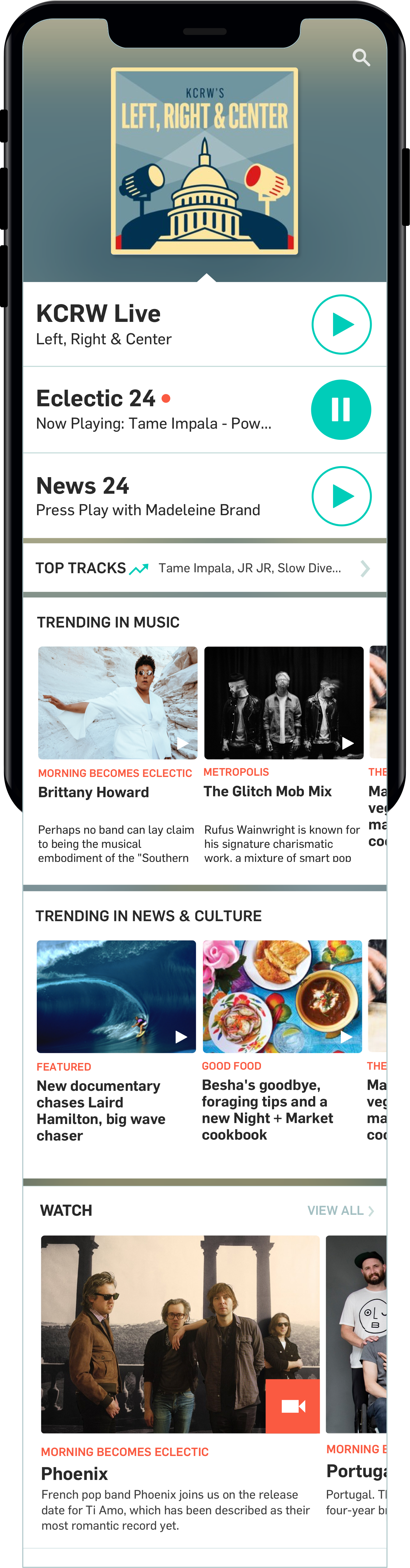
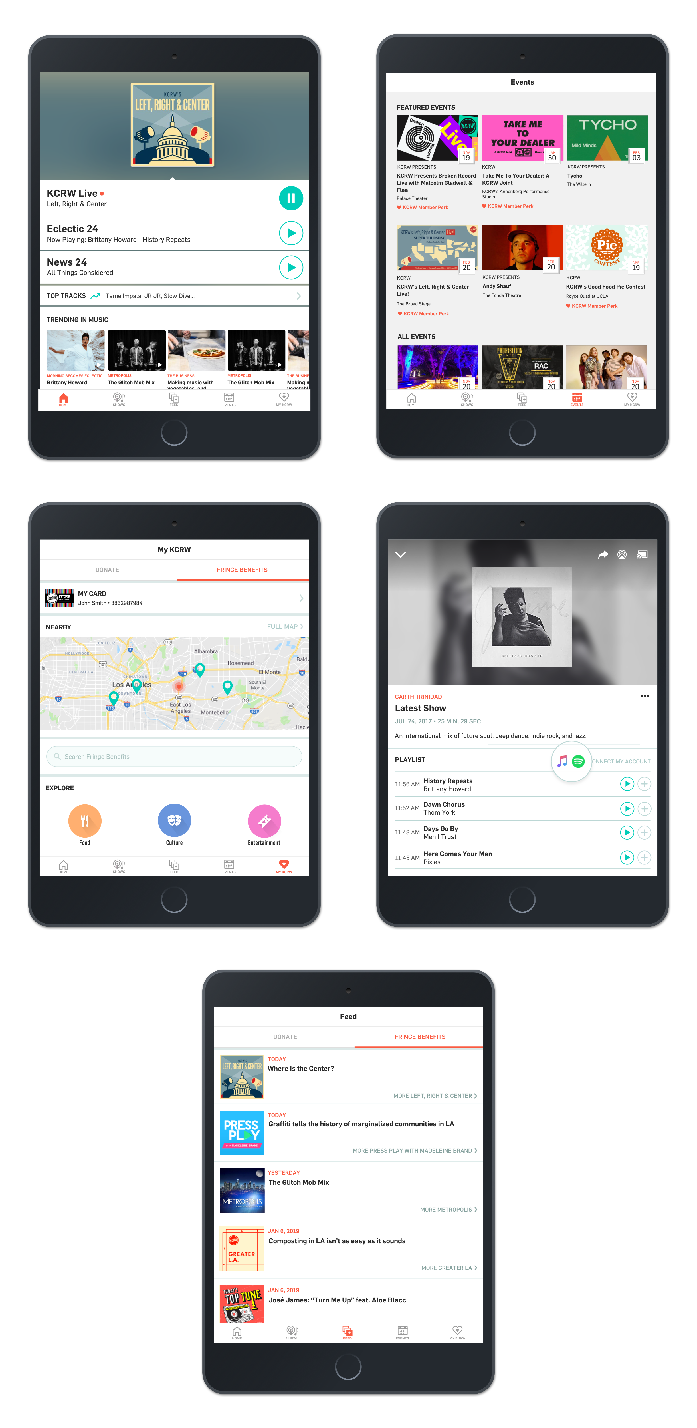
KCRW Radio for tablet