Maintenance Tracker & Community Hub
I designed system for residential community members to report their issues to management and track their resolutions. This project was a design exercise I took upon in applying for a role.
Role: UI/UX Design
Year: 2020
Client: Design exercise for tech company
Research: User Interviews
My first step was to understand the needs from potential users of this community. To begin, I posed myself high-level questions of what I wanted to seek out to understand. They were:
- Why do community members need a reporting system?
- How does a reporting system help its community members?
- Where are community members physically when they want to report issues?
- Do members feel connected to their community?
Broad Ideas Distilled into Specific Questions
Once I had a high level picture of what I was trying to do, I refined these inquiries into specific questions I could ask my interviewees:
Describe some common issues in your community...
Tell me about a time when a community reporting system would have made your life easier...
Tell me about a past experience when trying to report an issue in your community...
Tell me where you were physically the last few times you wanted to report or respond to a community issue...
Tell me about a time when you felt you were out of the loop with something going on in your community. How did you feel then?
Describe a time when you did feel connected to your community...
Interview and the Results
I asked two people I knew who lived in different types residential communities. The first, Daniel, lived in a mid-sized condo community comprised of approximately 200 units. The second, Steven, lived in a large apartment community with approximately 700 units.

Interviewee 1: Daniel
- Project manager at tech company
- Age 33
- Likes bike riding, going out for walks, going to movies
- Owns condominium in community
- Approx 200 units
- At work uses mostly laptop.
- At home and in public uses smartphone.

Interviewee 2: Steven
- Corporate recruiter at gaming company
- Age 32
- Likes music festivals, going to the beach, trying out new restaurants
- Lives in apartment community with approx. 700 units.
- All are 1-2 beds
- Young demographic (20-30s)
- Approx 25% are students
- 50/50% male-female ratio
- Uses smart phone for everything (except at work).
Key Takeaways

Doesn’t like installing new apps, wants to use existing means of communication like email and text.
Usually home when issues arise, but will input maintenance request while at work
Doesn't like app notifications, but likes email notifications
Website & page for prospective owners to help increase property value
Would like to be able to report and track issues outside of business hours
Finds it easier to create maintenance request on desktop computer (vs mobile device)
Would like email or text updates if pertinent to them.
Need to access to rules, basic info and FAQ’s
Would like option to receive regularly community updates.
Questions Posted to an Online Group
In addition to the 2 interviews I conducted, I wanted to see if I could cast a wider net and get feedback from more potential users, so I posted my question on an online forum (a Reddit subreddit :) and got a few responses. The questions can be summerized as:
What frustrates you about your community reporting system?
What would you like to see improved?
The results were:
Want rent payment to be accessible from community website
Want info & resources for more urgent maintenance issues in an easily accessible place
Would like a more visually appealing website and issue tracking system
Frustrated by lack of provenance and reasoning behind rules and HOA guidelines
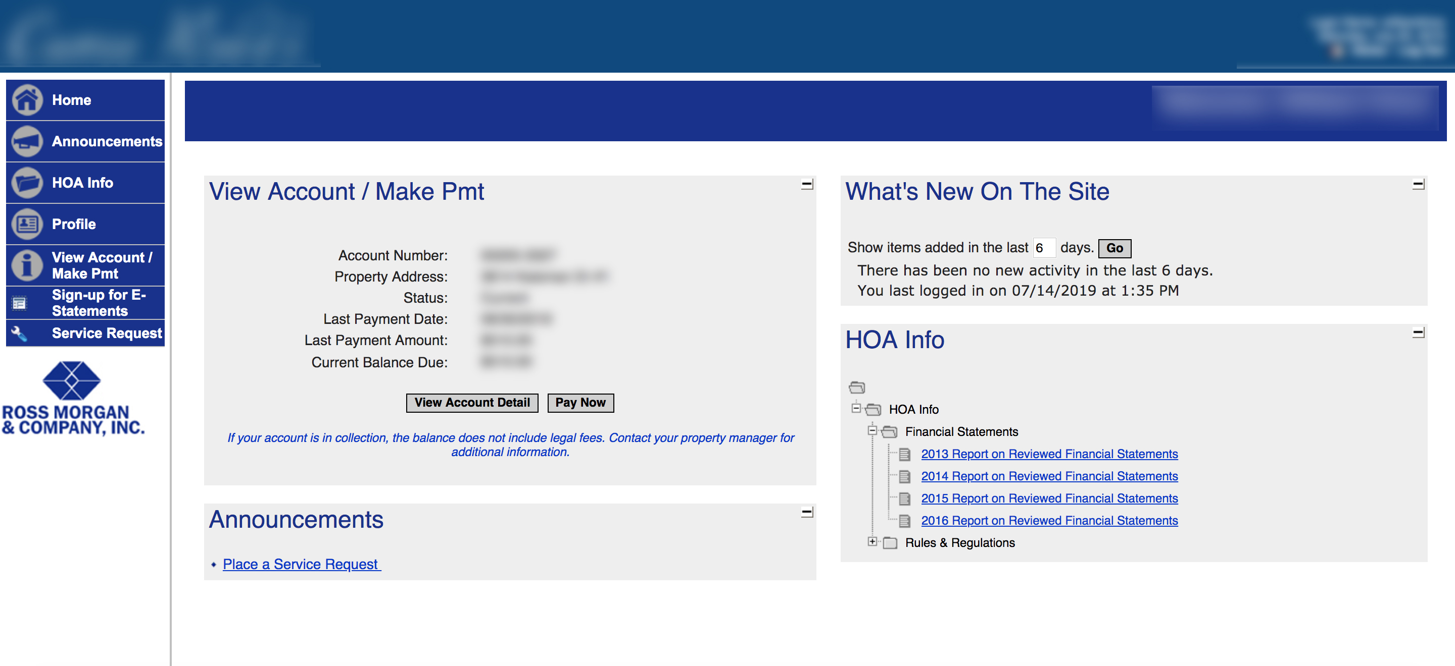
Competitor Analysis
Next, I decided a competitor analysis would give me a lot of information as to what similar products were achieving. I compared the products from where my two interviewees lived. Right off the bat I could tell one product had much more thought and resources put into it, while the other was dated and lacking beyond basic features. One was warm and inviting, with large imagery and text leading the viewers eye, while the other overly technical, lacking in focus, and even functionally broken in places.
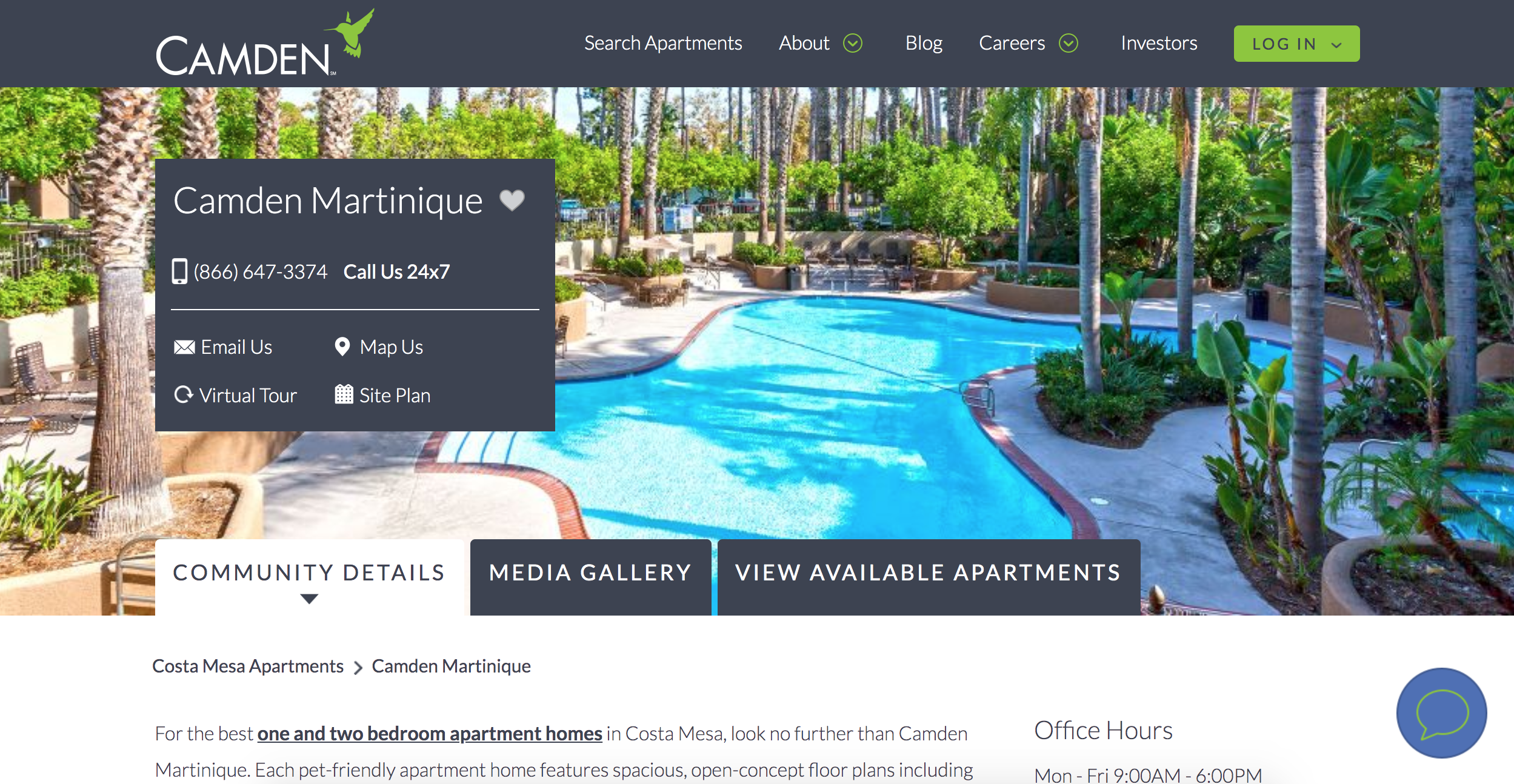 Competitor A: homepage
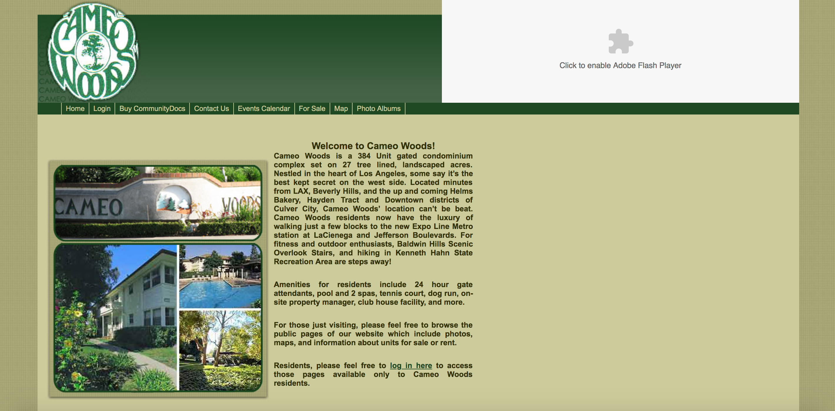 Competitor B: homepage
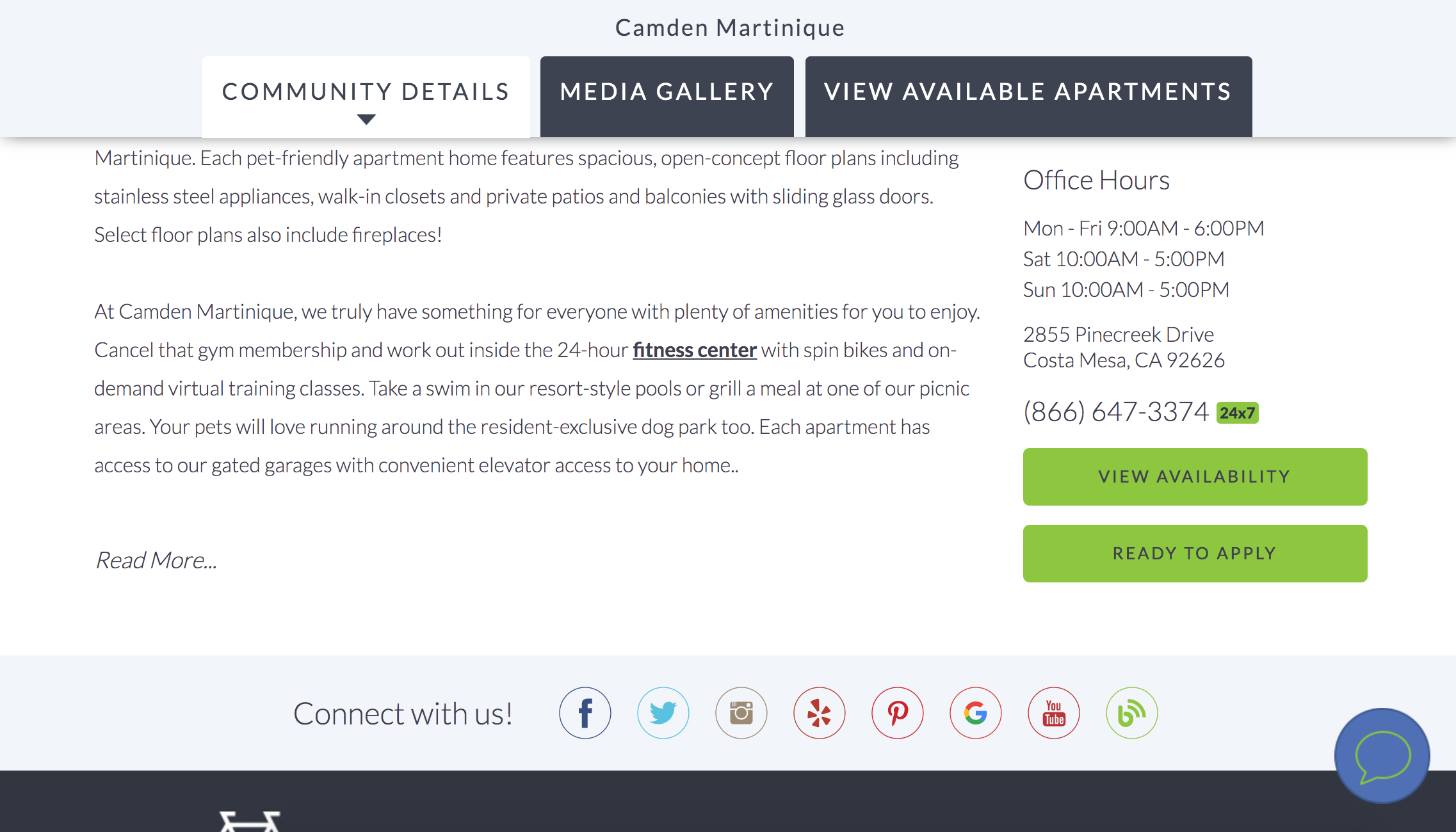 Competitor A: homepage, below-the-fold
 Competitor B: login portal
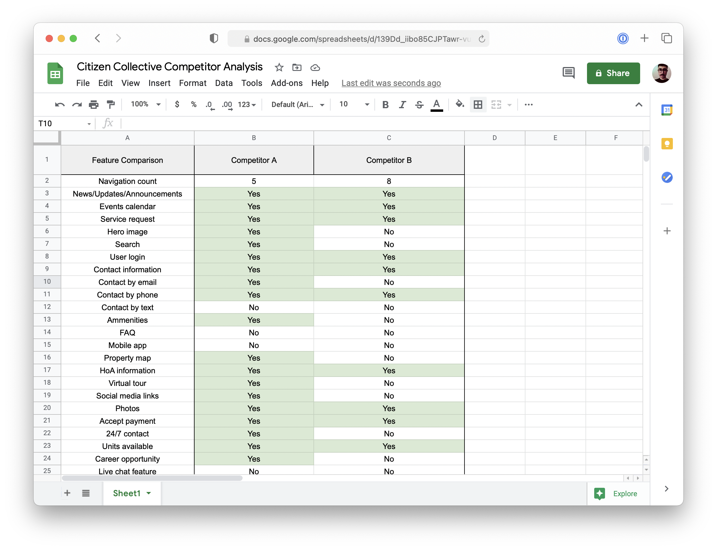
Organizing the results in a simple spreadsheet allowed me to easily compare and contrast the different features of these two tools.
User Profiles
From the results of my research I put together 4 profiles to represent the general makeup of the residents in my target community. This would allow me to more clearly understand who this newly designed product would serve. The four profiles encompassed a diversified group of community members that I hoped my solution would be able to serve.
Unrelated Tenants
- Age: 25-40
- Gender: 50% male/female/other
- Work experience: 5-20 years
- Work hours: 40-50 hours per week, variable schedules
- Education: Bachelors
- Income: $35,000-$60,000
- Technology: computer, smartphone, high internet connection
- Unit size: 1-2 bed
Young Families
- Age: 0-35
- Gender: 50% male/female/other
- Work experience: 10-20 years
- Work hours: 40-50 hours per week, generally 9-5/mon-fri
- Education: Bachelors, some masters
- Income: $35,000-$65,000 (x2 = $70,000-$130,000)
- Technology:both computer and smartphone
- Unit size: 2-3 bed
Older adults or retired with no live-in children
- Age: 55+
- Gender: 50% male/female/other
- Work experience: 35-50 years
- Work hours: 0-40 hours per week, some part time, some retired
- Education: Highschool to bachelors
- Family Income: $25,000-85,000 (x2 $50,000-$170,000)
- Technology: mainly computer, some smart phone
- Unit size: 2 bed
Landlords, vacation renters
- Age: 50-75
- Gender: 50% male/female/other
- Work experience: 30-55 years
- Work hours: 30-40 hours per week, variable schedules
- Education: Bachelors, some masters
- Income: $80,000-$100,000
- Technology: computer, smartphone, high internet connection
- Unit size: 2-3 bed
User Personas
Then, I wanted to further realize my end user into personas that I could visualize more concretely. This would hopefully allow me to be more empathetic when working on my proposed solution.
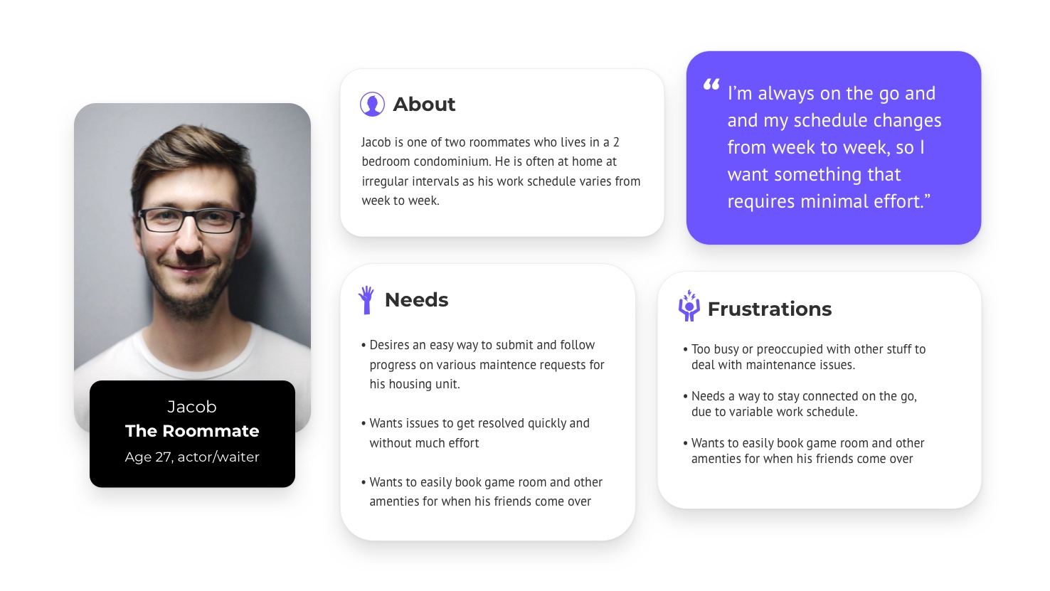
The Roommate
“I’m always on the go and and my schedule changes from week to week, so I need something that requires minimal effort.”
- Wants minimal effort solution.
- Doesn’t care to follow up with issues unless pertinent to him.
- Not active in community.
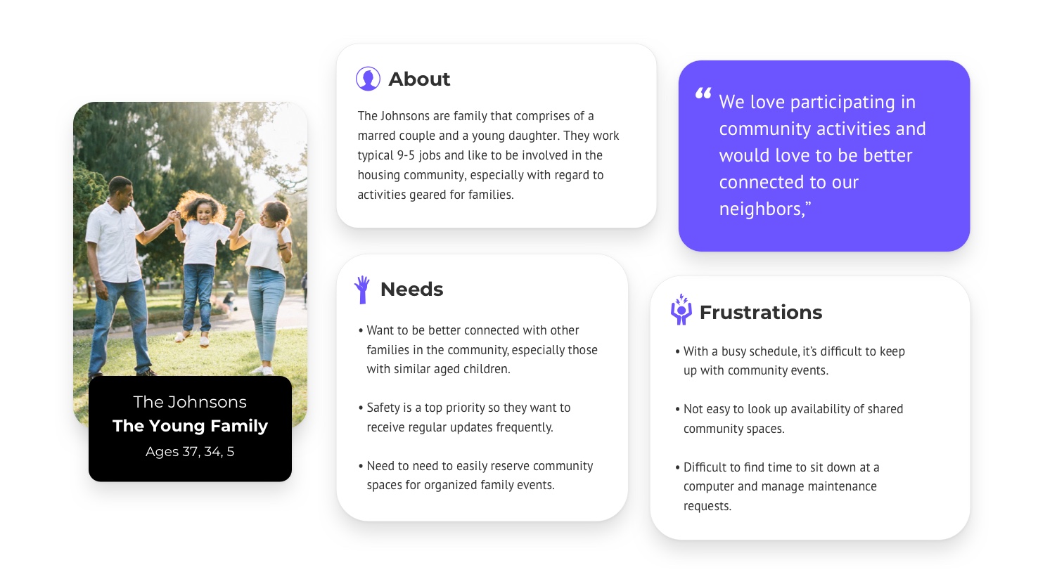
The Young Family
“We love participating in community activities and would love to be better connected to our neighbors”
- Want to participate in community events.
- Safety issues are a top priority.
- Need way to keep whole family informed.
The Empty Nesters
“We need a simple way to report issues and stay informed. We prefer the good old fashioned telephone, but are ok using email.”
- Not too tech savvy, but still need to manage maintenance issues.
- Wants to stay updated with community news.
- Prefer phone but also comfortable with email.
The Landlord
“I need an efficient way to report and manage issues for my multiple vacation property rentals.”
- Needs a way to manage maintenance requests remotely.
- Needs easy way to stay informed about changes to community rules.
- Wants property values to go up.
Visualizing Common Problems with Storyboards
Though I don't always sketch out storyboards, here I felt it would help me visualize real issues members of this community might face. These stories focused on the subjects of my personas encountering problems around 1) a maintanence, 2) reserving an amenity on the property, and 3) calling a 24/7 emergency maintenance hotline.
Wireframing My Ideas
After getting a clear sense of possible issues in this community, I began wireframing solutions. Once I felt I had a solid idea sketched out, I annotated them for future reference and for anyone else who might need to see them. My primary solution was a responsive website that would serve as a hub for this community. Websites can be accessed from any device and can be easily found while searching online.
Exploring Alternatives
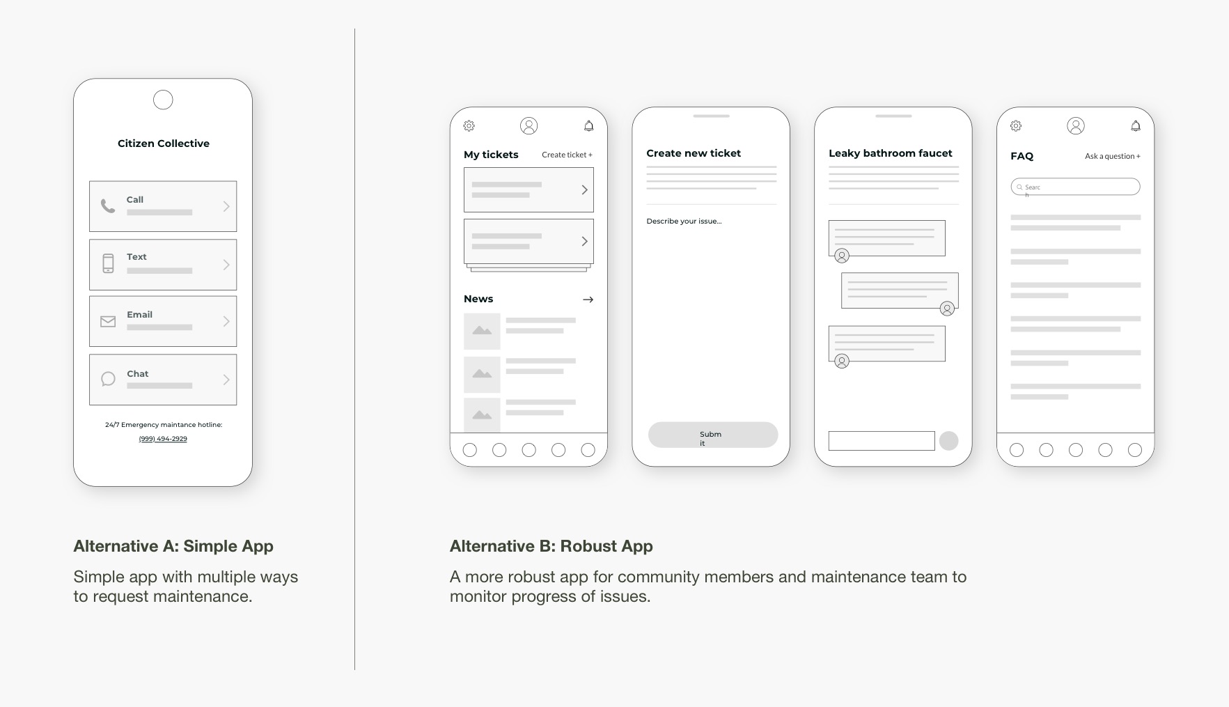
Though I knew my main solution was likely going to be a website, I wanted to explore other possibilities. The first alternative was a more robust mobile app. This is what I initially had in mind when I started the project, but came to realize throughout my research that community members having to download a mobile app could serve as a major hurdle for people who either do not have mobile devices or simply didn't want another app on their phone. Still, I felt it was worthwhile to explore.
Considering Non-web Alternatives
As designers we often think that the solution lies within some kind of website or mobile app, but that's not always necessarily the right approach. People sometimes prefer to interact with something other than a UI. These are two other alternatives that could be used in a residential community.
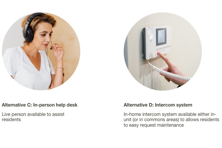
Had this residential community been much larger (and therefore less costly per person to staff someone on site), I could see the use of an in-person help desk be more convenient for residents. Often times being able to speak to someone face-to-face and explain your problem can get a faster resolution to your problem. Additionally, the psychological benefit of knowing someone is there to help you in a potential emergency (such as burst pipe or electrical issue) is reassuring.
Alternatively, a kind of intercom system could be implemented to allow residents to quickly communicate with the maintenance staff. However, with the ubiquity of mobile phones, this may not be necessary, but I still wanted to consider the idea.
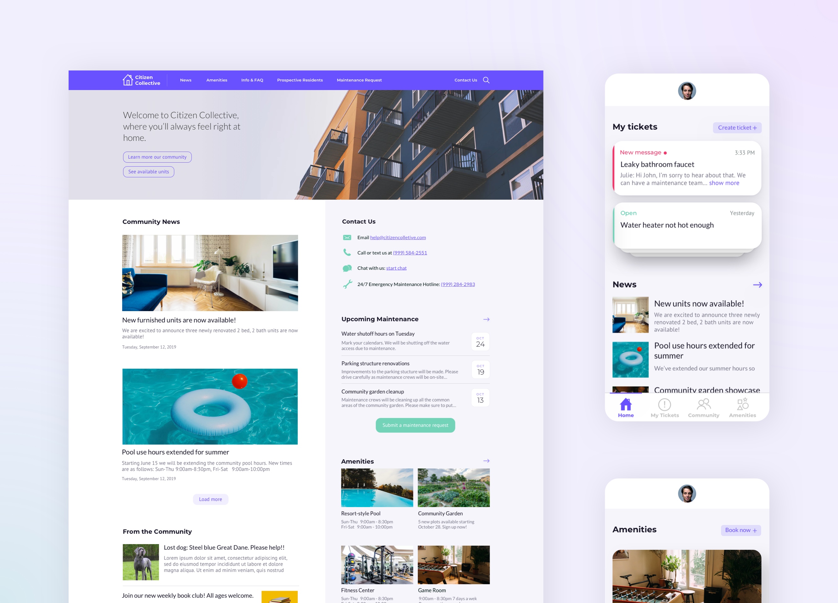
The Final Design
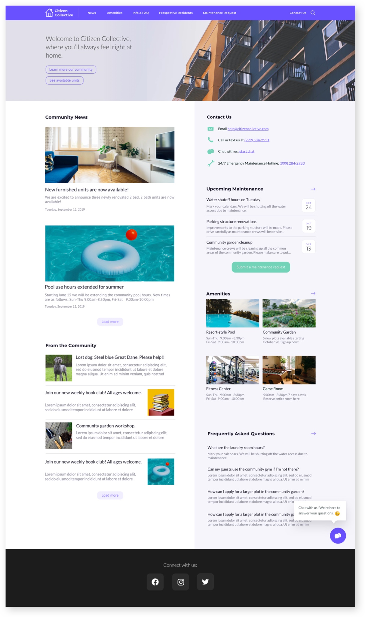
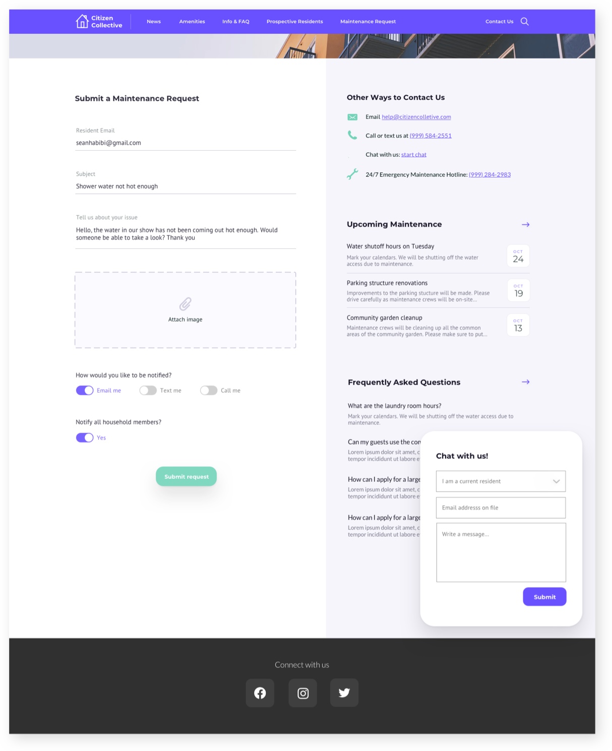
The final design comprised a website with as much information as possible on the homepage, allowing users to get a glimpse of all the content without having to click off to a separate page (unless they wanted to dive deeper). I employed a two column layout in order to get as much information as possible above-the-fold while still hopefully not over-diverting users' attention. I placed official news and community updates in the main column, and contact info, maintenance and other useful bits in the wide sidebar.
What would a full-fledged app look like?
Though I came to the conclusion that a website would be most appropriate for this community, I wanted to explore some keys screens for what a more robust app could look like, using the same design language from the website mockups. Below are a few key screens which include a splash, home, ammenities and maintenance ticket request screens.
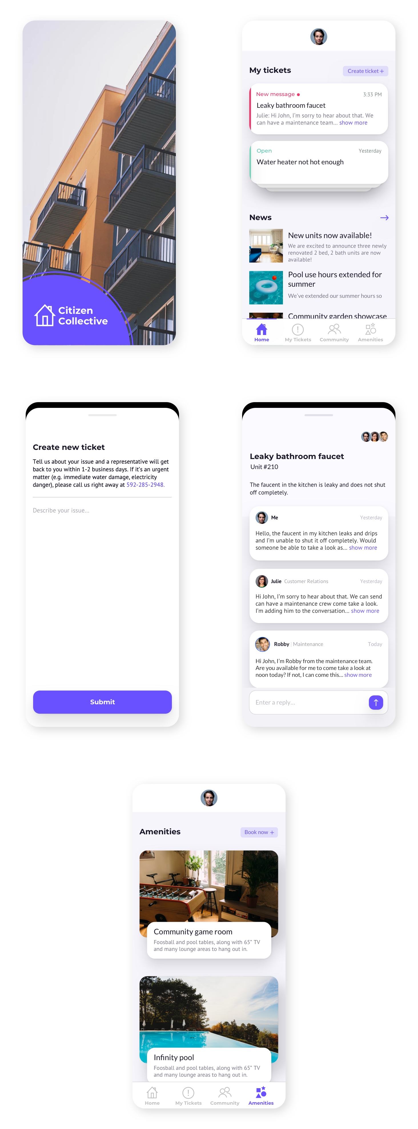
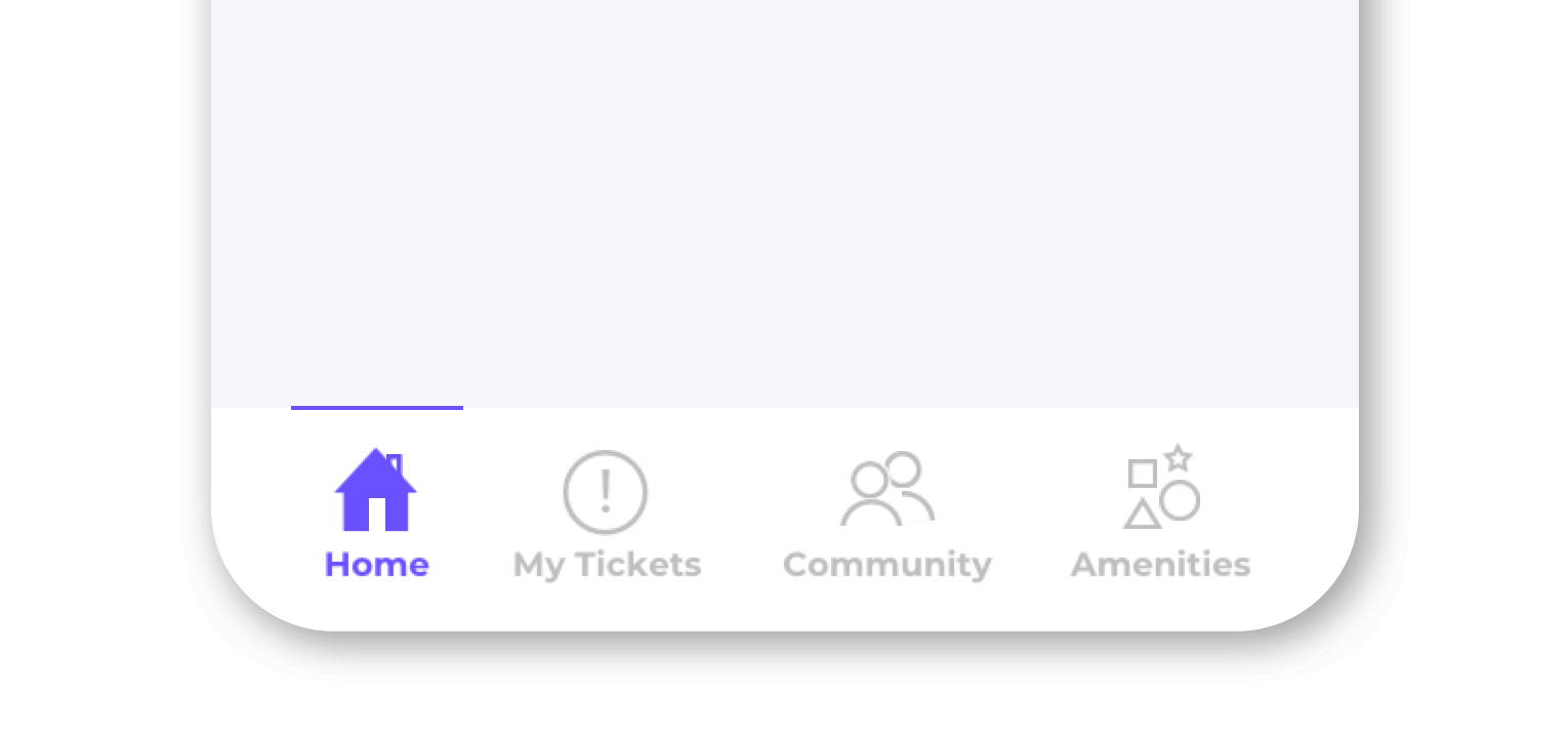
And here is a closer look at the navigation with custom icons.
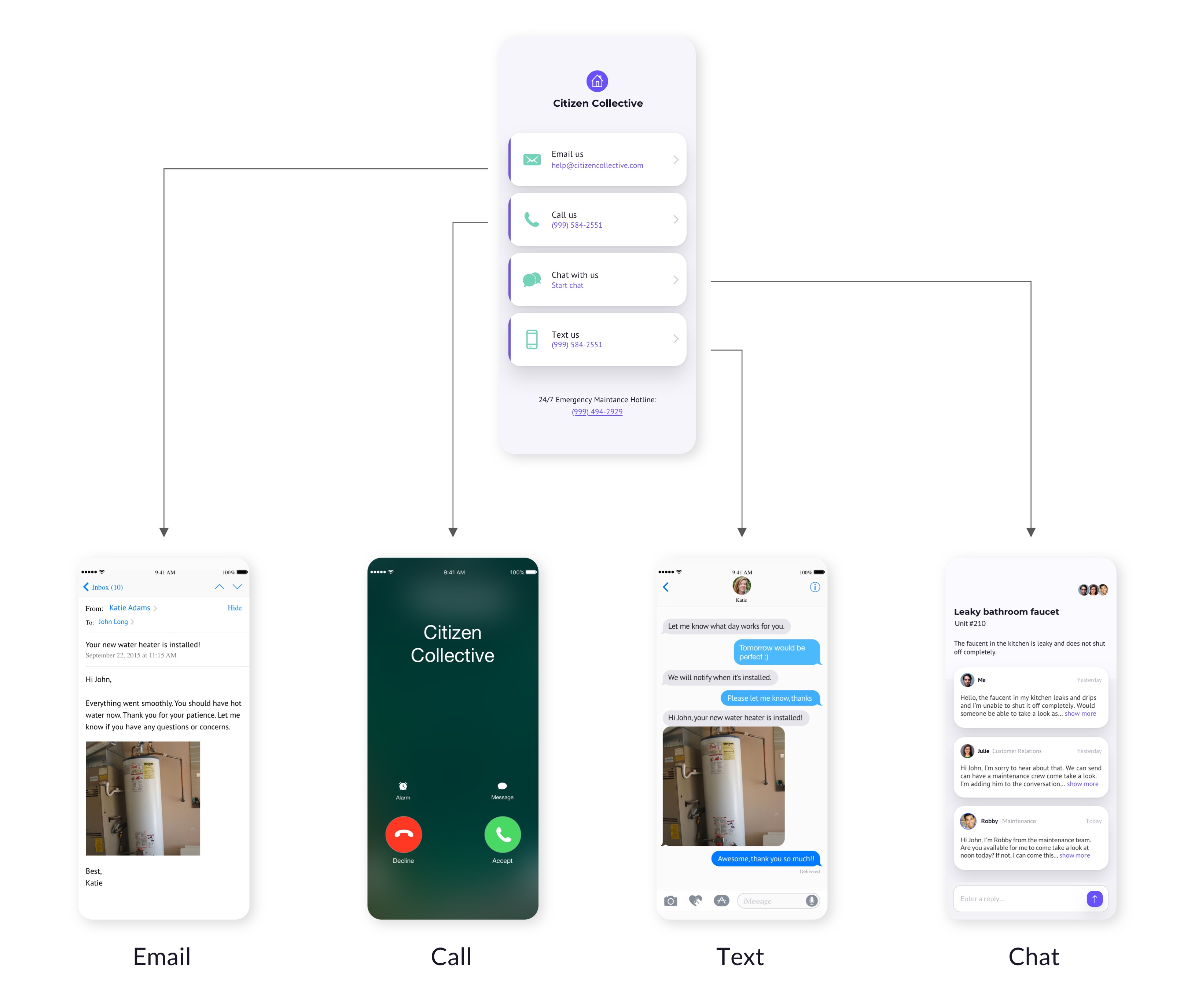
Final Alternative: A Very Simple App
Lastly, I wanted to explore a more simplified version of an app. One that residents could download and keep handy on their phone, while not needing to get involved in more robust features. I'm envisioning this app is centered around one primary home screen with quick access to the different ways to contact the maintenance team. These are all the established ways people like to communicate, so it's hard to go wrong: email, phone, text message and chat.
What I Learned
This project taught me that solutions come in many forms. Often, they are simpler than we may have originally expected. I know my personal bias (and excitement!) going into this project as a designer was to create a feature-rich, robust solution like an app or web platform with all the bells & whistles one can imagine. However, often there is an unseen cost to more complex solutions in the form of cognitive overload and material price (i.e. $ upkeep). So, these must always be taken into account. Just because we can build it, should we?