KCRW.com Home, Section and Category Page Redesign
With over a million monthly users, KCRW.com allows listeners to hear live radio, music, news and culture podcasts, as well as read articles and discover community events. The redesigned top level pages improved the discovery and organization of the content.
Role: UI/UX Design • HTML/SCSS
Year: 2018-2019
Client: KCRW
Redesigning KCRW.com's home and section landing pages
As part of the organization's effort to simplify its web experience and funnel its users to its latest digital content, I had to redesign the homepage from the ground up, as well as create new landing pages for its primary sections (Music, News, and Culture).
My Role
My role in this project was as both lead designer and front end developer. I was responsible for gathering research, developing ideas, sketching/designing mockups, producing front end markup, and working with developers to see through implementation.
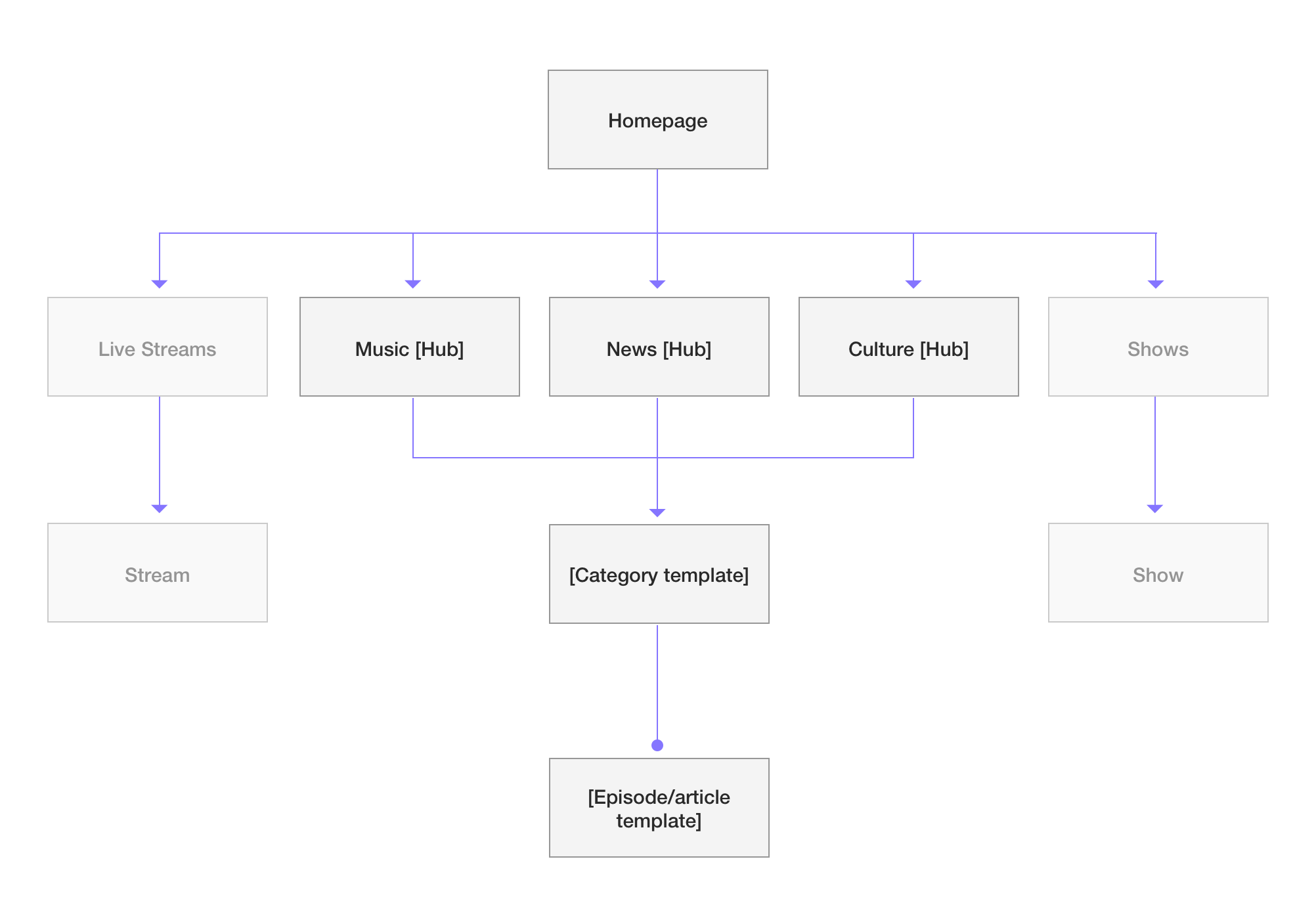
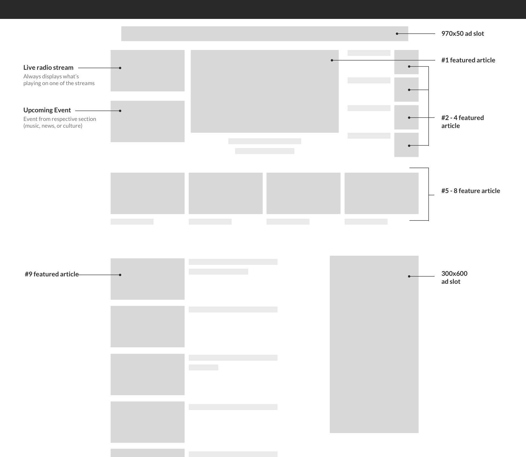
A template with interchangable parts
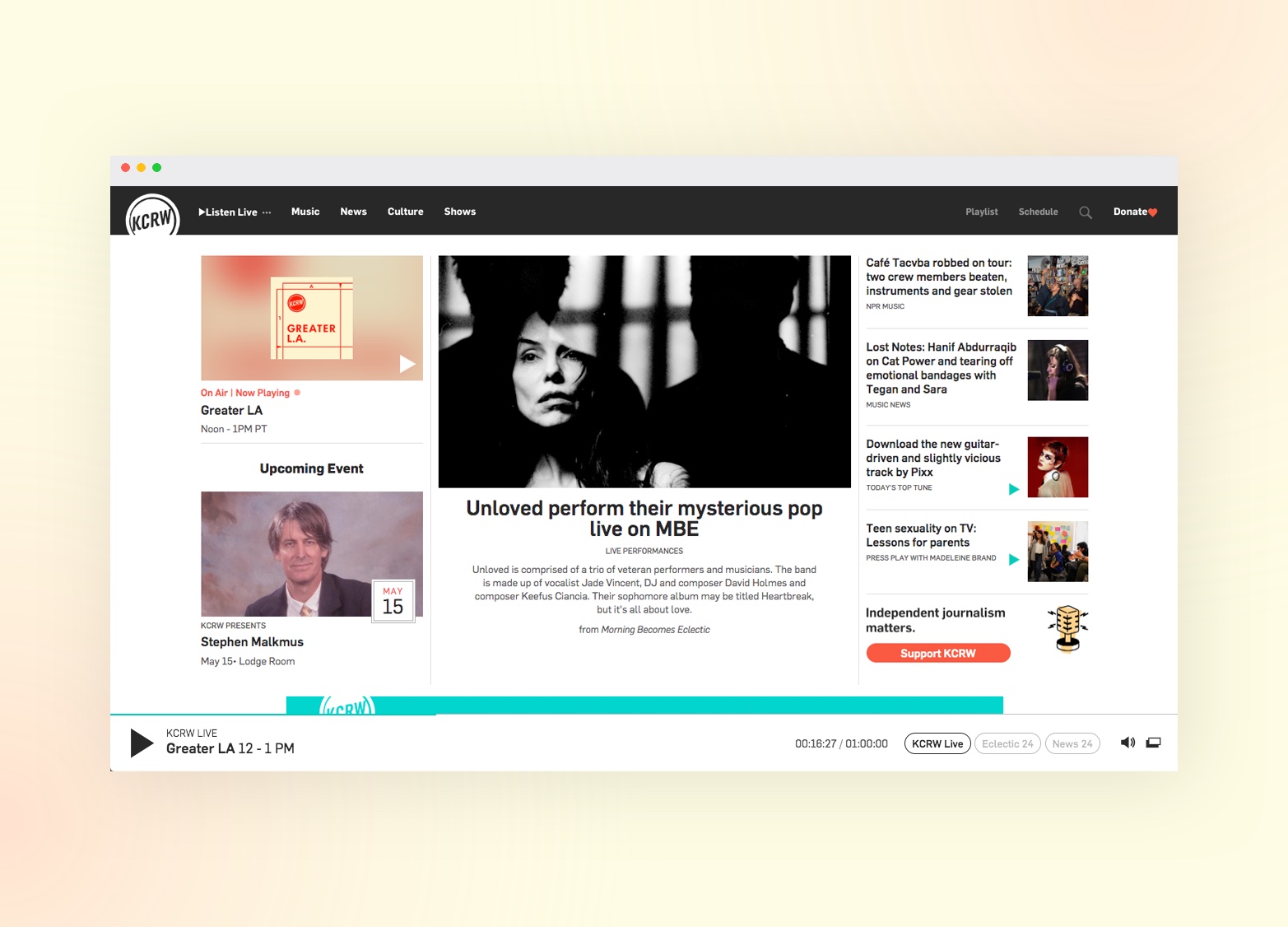
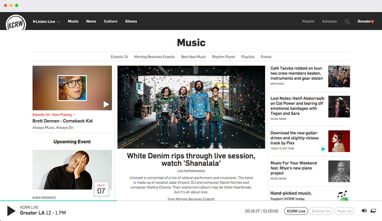
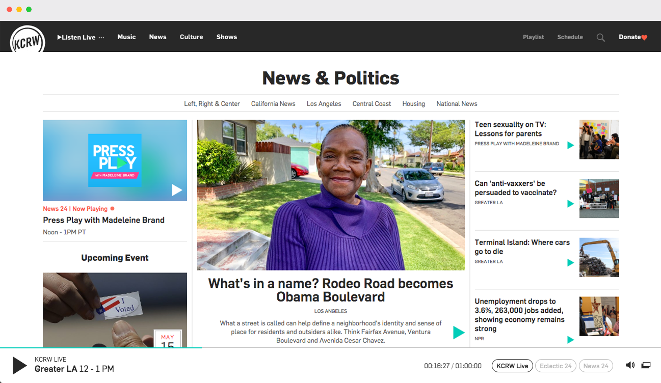
The design for this template would be utilized across 4 pages: the Home, Music, News, and Culture section pages, with the last three representing the main facets of the organization. These pages would share the same template but filter their content depending on the section and time of day. The homepage would have additional section below the fold, and I would also need a separate category template for deeper discovery of content.
The Approach
With this design, I wanted to fit more content above-the-fold since users would be primarily coming to these pages to discover and browse casually. The more stories in view, the more likely something would catch their attention. This template would employ three levels of hierarchy to allow editors to assign appropriate emphasis, while still providing ample space for other stories to sit high up the page.
After I determined the overall structure of the site I began putting pen to paper which allowed me to quickly sketch possible layout configurations for the templates. Through discussion with stakeholders I had several critera:
- Fit more, and better represent content above the fold (through heat maps I could see that scroll and clicks dropped significantly as users moved down the page).
- I wanted to create more of a news site aesthetic to aid in presenting the credibility of the content.
- Editors wanted to be able to give prominence to certain stories, rather than of having three equal weight cards side-by-side as was employed on the existing design. Having a large tile would also allow us to put the live music performances front and center as they were happening.
Sketching out this stage allowed us to iterate and discuss without getting bogged down in the details of the design.
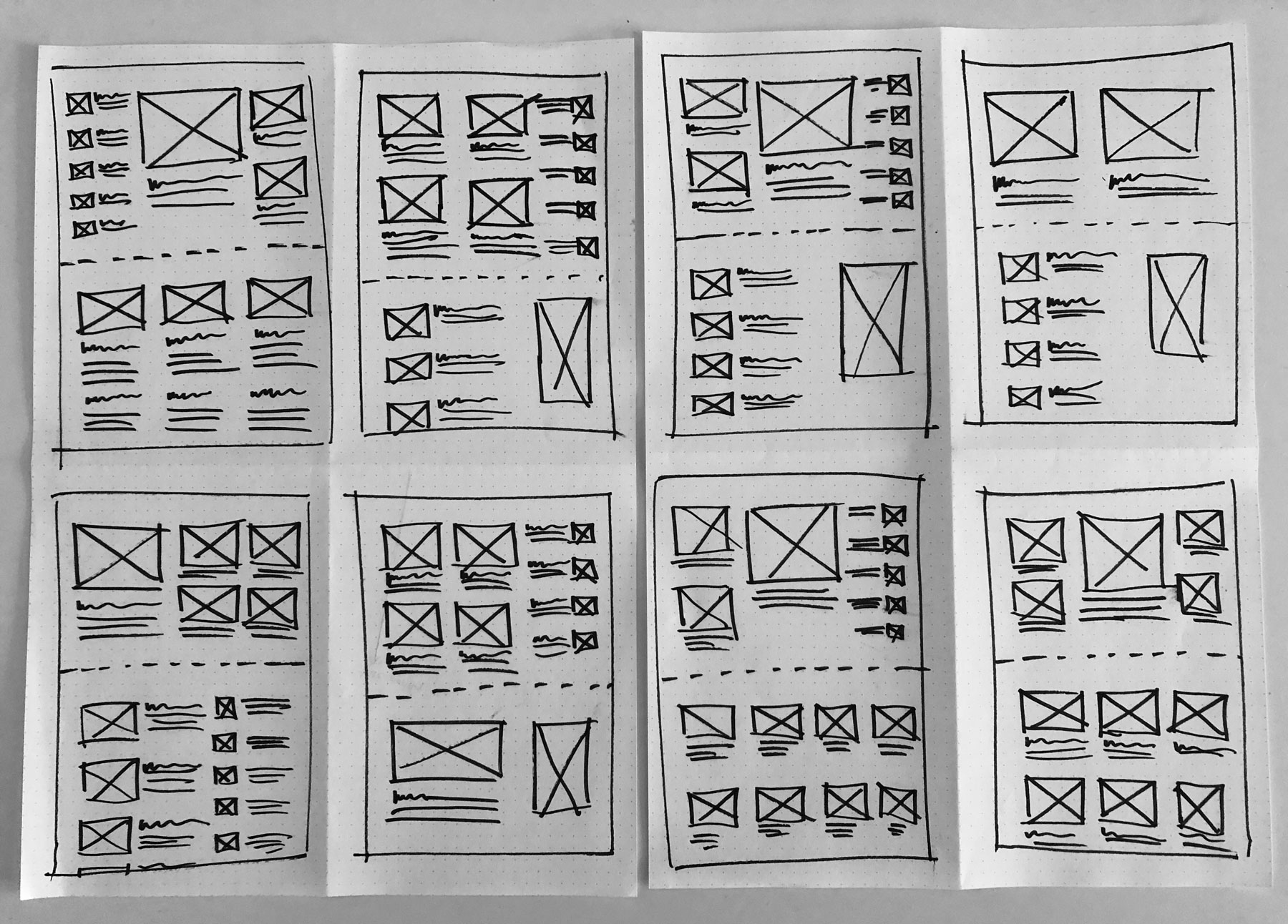
Some initial concepts for home and hub template layout
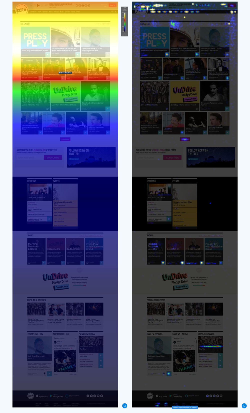
Clicks and scroll heat map of existing home page. Majority of engagement above the folder and at the top-left of the screen.
Annotated wireframes
My Approach
Because these templates would serve as the major points of discovery on the site, I wanted to fit as much content above-the-fold as I reasonably could, and present it in a way that indicated some hierarchy.
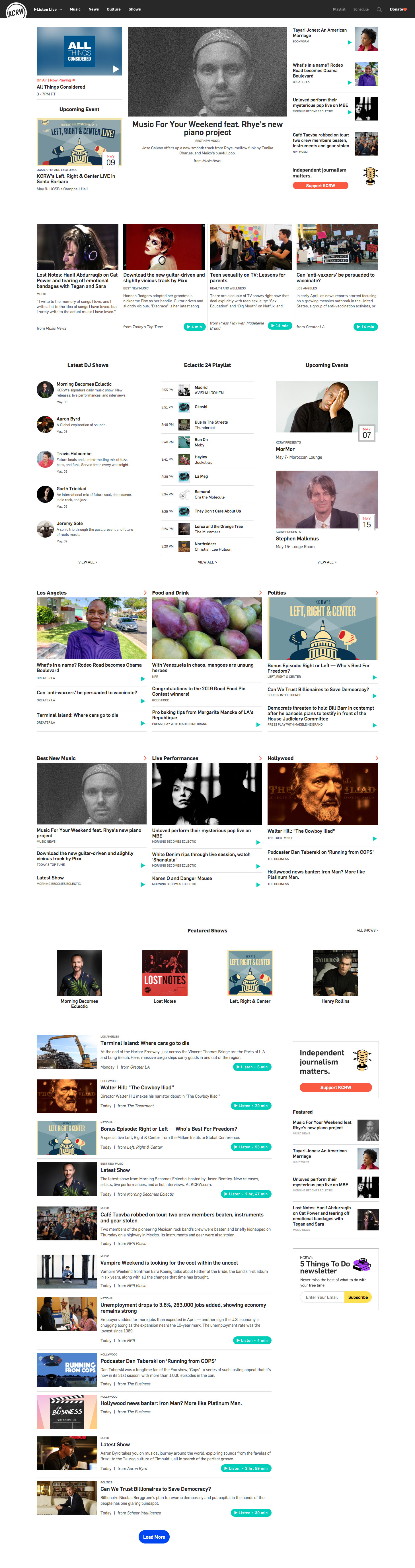
Looking at some of the early data, I could see that with the redesign increased listen starts by 20%. Though because of the drastic change in layout, admittingly it's difficult to pinpoint which improvements had the greatest effect. It's clear however, that several factors had made an impact, including:
- Differentiating the live stream tile from other pieces of content
- Including album or song artwork for the currently playing track
- Adding easy access stream switch buttons to the player
- And making the first item in the navigation a one-click stream listen button
I also found that page views increased by 7%, indicating that people were consuming more content (but not as much as I hoped for). This could be attributed to the fact that users were listening to more audio on the site and therefore didn't feel the need to continue browsing. A win for the team nevertheless.
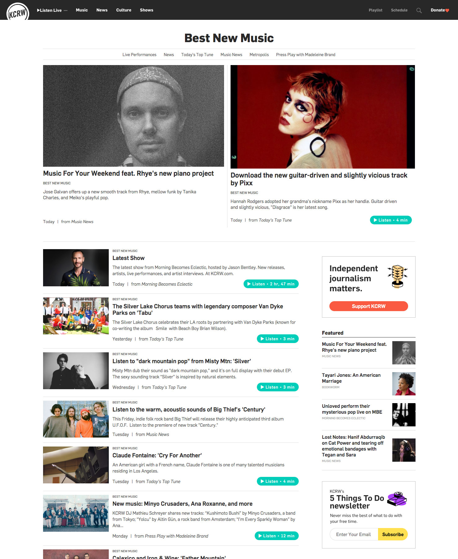
Category templates for deeper diving
In addition to creating 3 hub landing pages (Music, News, and Culture), the redesign warranted a separate template for further discovery of categories. I would implement a similar layout, but instead go for a simpler 2 column featured section at the top. This was due in part because:
- I wanted to focus users' attention on the two most recent posts from categories as these sections would inevitably not have as much content
- I wasn't as concerned with 'below the fold' scrolling here because I felt safe to assume that if you already clicked into a category, you would be more willing to scroll down and view more content.
New Shows directory and Article/episode templates
As part of the redesign I also had to revamp some of the site's deeper pages like the shows directory, Show template, and episode/article templates.
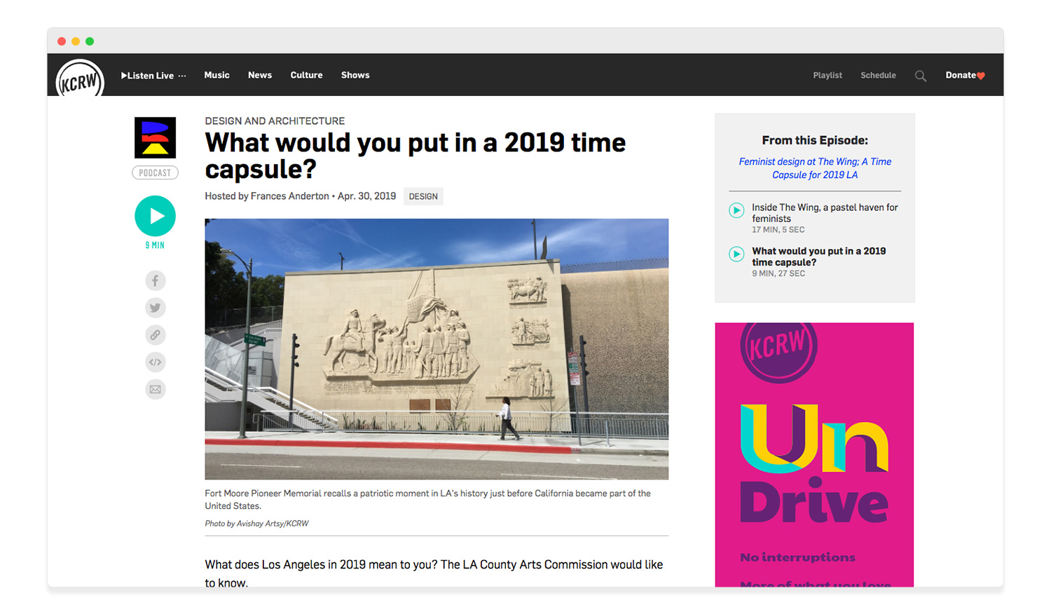
The template above would be used for both articles and episodes with some modular components. For episodoes with audio pieces attached, a play button would appear in the left column, whereas content without audio no play button would be needed. For segments that were part of larger episodes, a small card at the top right would allow users to quick view all segments belong to the single episode. For articles without this, the sidebar ad woud simply slide up.
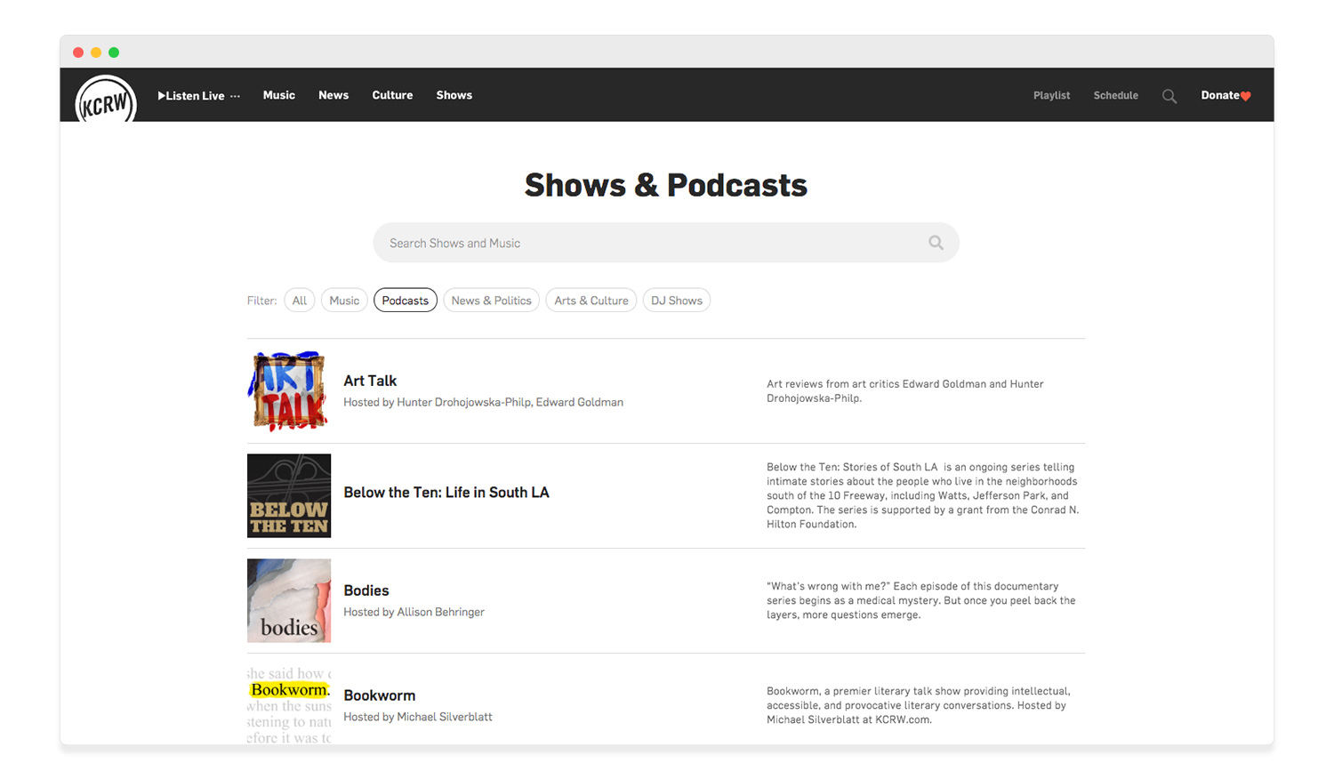
The new shows directory would be a simple list ordered alphabetically along with a prominent search bar at the top, as well as a few categories for quick filtering. This design would allow for a more content-agnostic approach and eliminate any internal competition for space on the page.
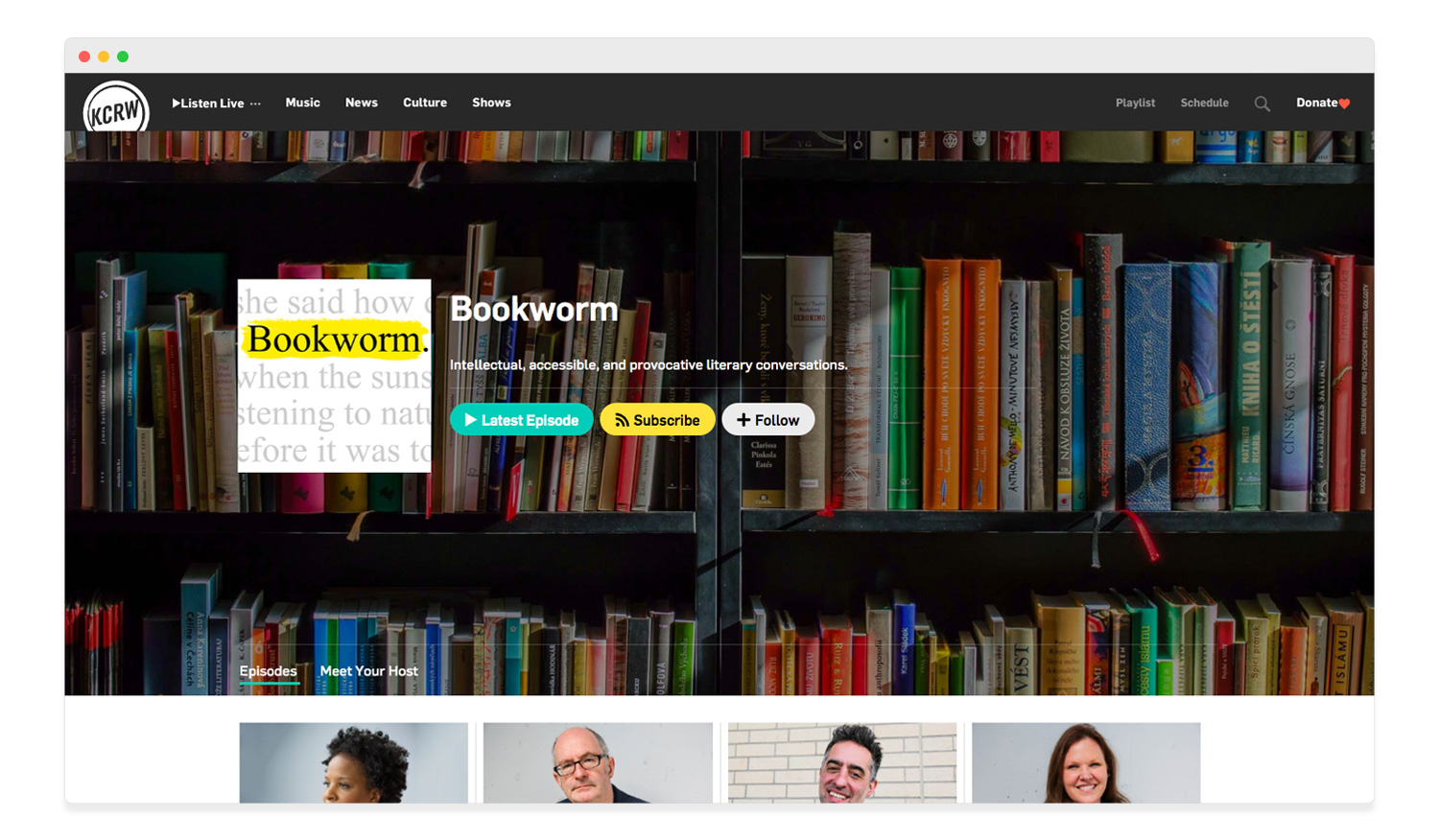
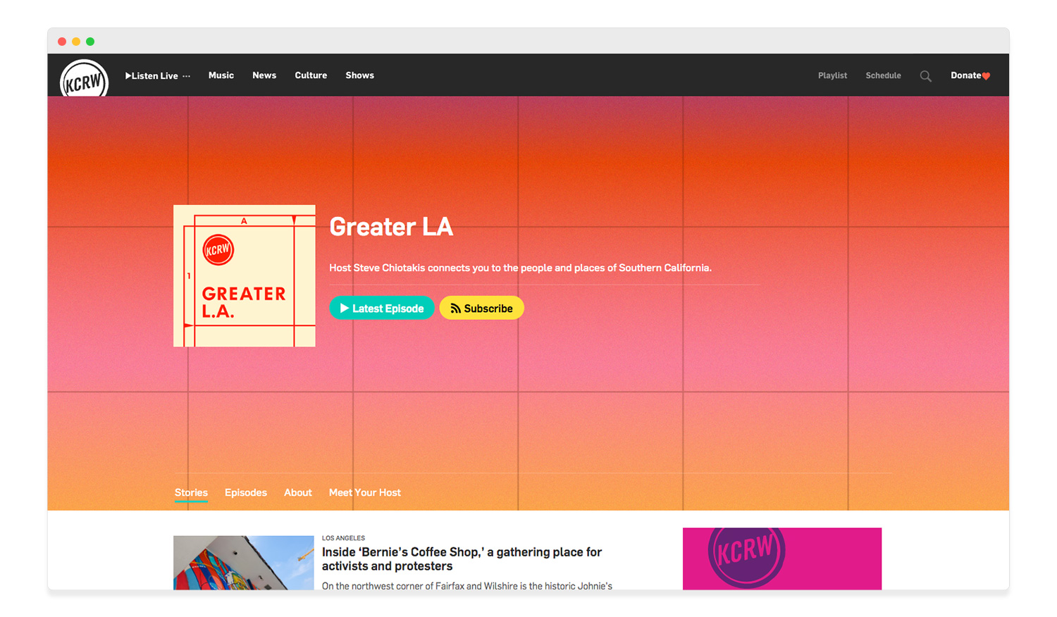
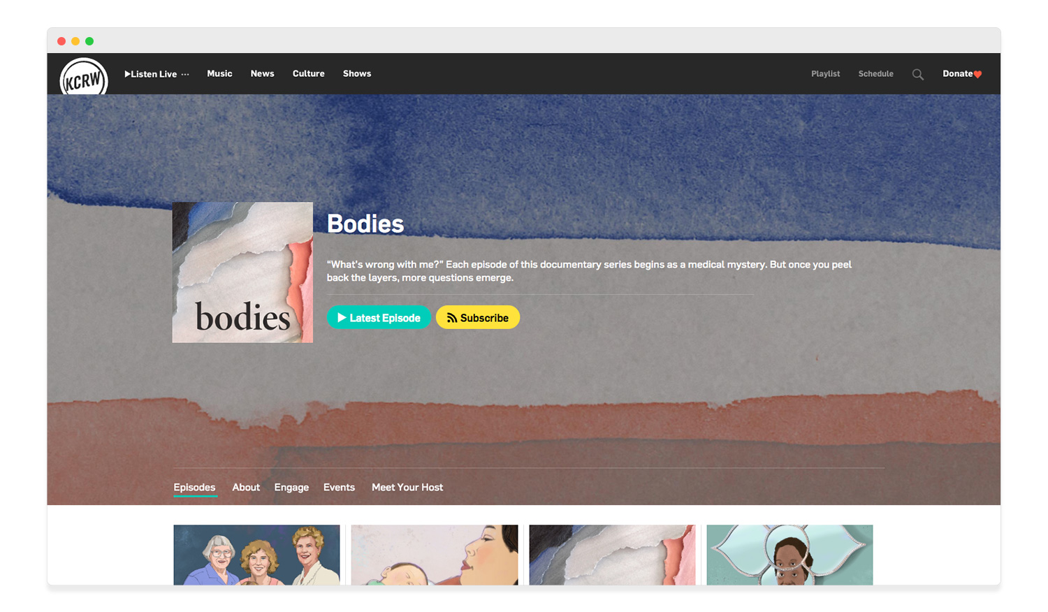
The new show template above would feature large scale hero background images to allow better exploration of our podcasts.
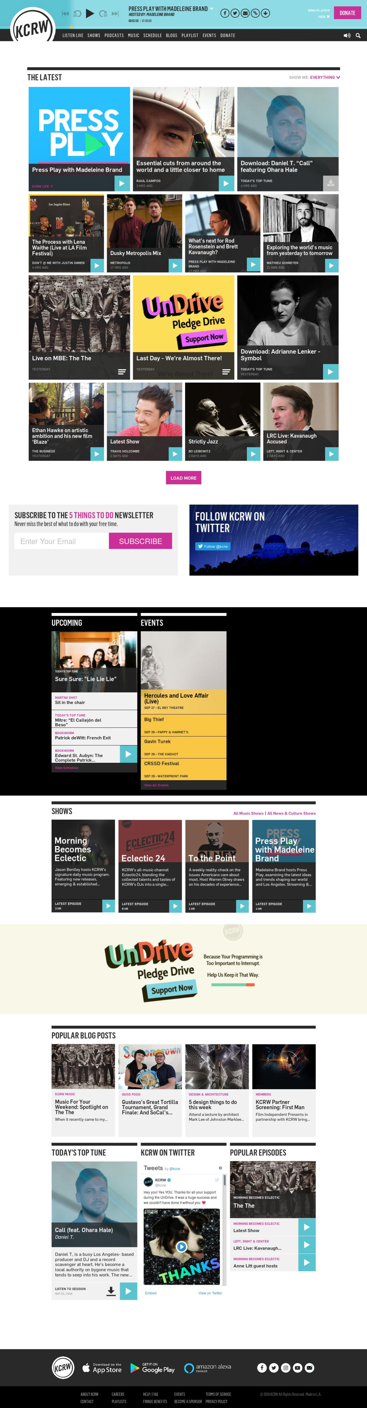
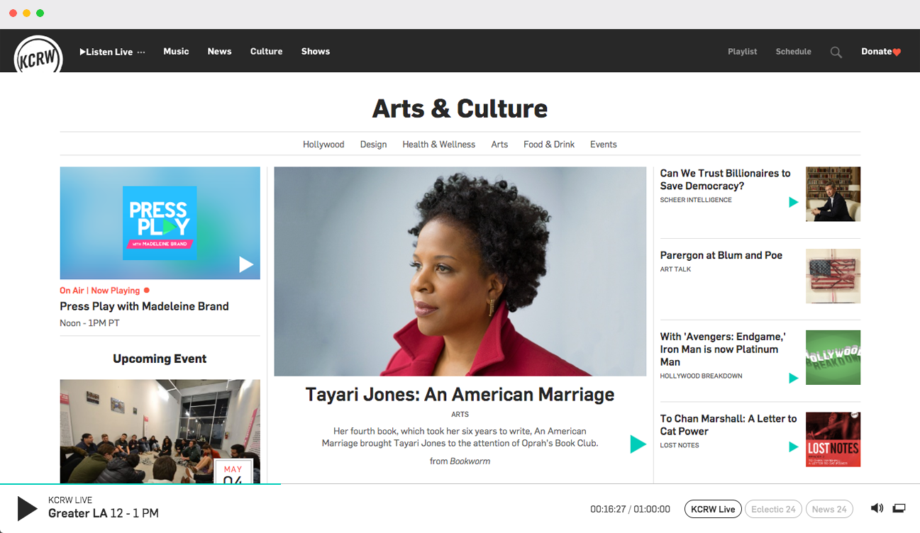
The previous design
The existing tempate had become a hodge podge of different tiles over time and lost its unifying look. It's lack of white space made the page feel cramped and not difficult to read. The page it seems was designed for imagery to be its prominent feature, but it became clear that image quality was not good enough for it to be relied on.