Radio, Music and Podcast website Navigation & Player Redesign
I redesigned the KCRW.com website's navigation and audio player to improve content discovery and ease of navgation around the site without interruption of the listening experience.
Role: UI/UX Design • HTML/SCSS
Year: 2019
Client: KCRW
Simplifying choice and highlighting best content
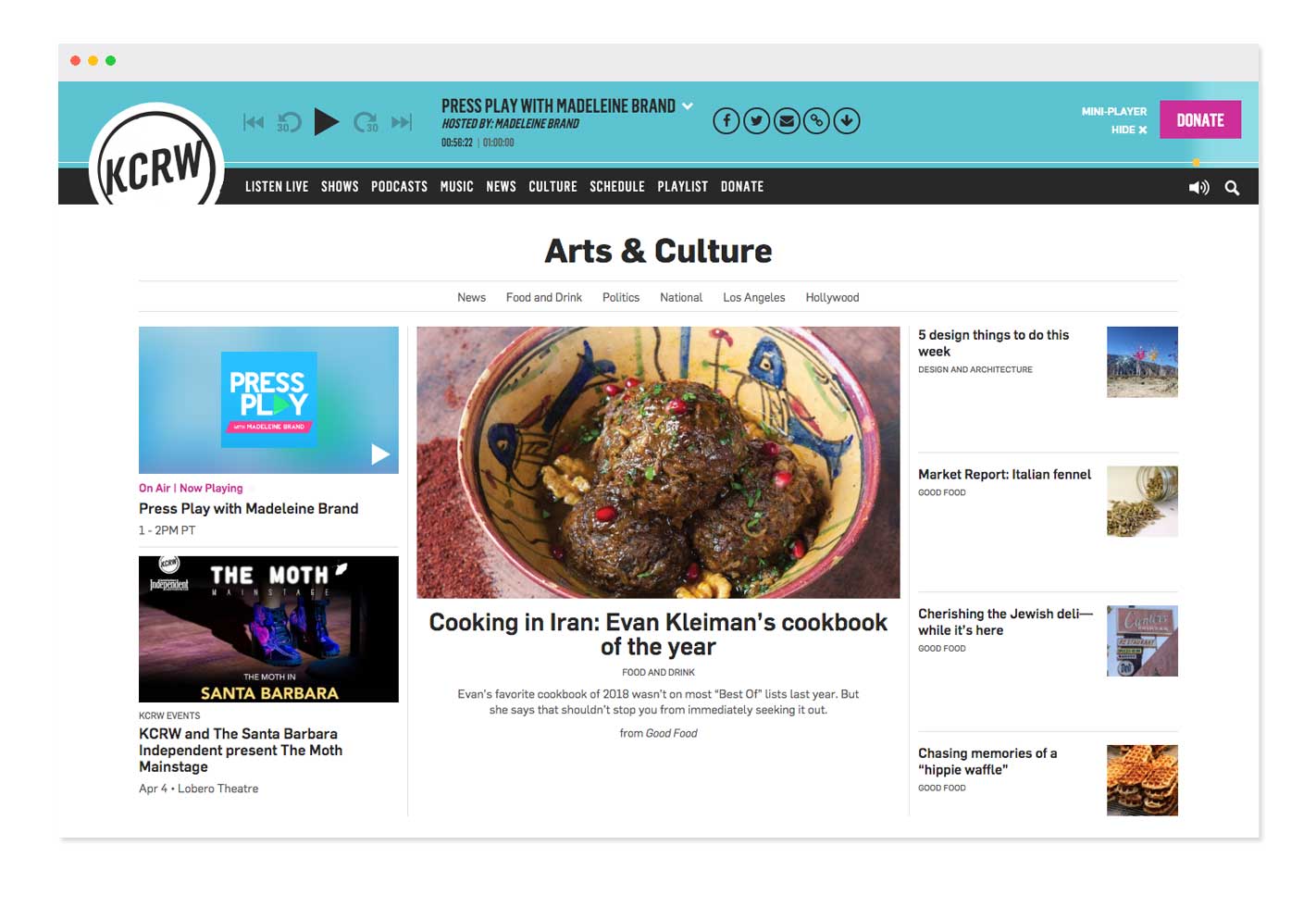
Over time KCRW.com's navigation grew cluttered and lacked direction. This made it difficult for users to know what were the prominent pages and where to find the latest and featured content. Also, because the site was becoming more story-focused than show-focused, the visual presence of the audio player needed to be reduced, but remain as accessible as before.
Splitting up things
With the existing design, the audio player and navigation were both fixed to the top of the screen. While this made it very easy to locate those features, it drew too much attention away from the content below it. With the redesign I opted to split them apart - keeping the nav at the top, while anchoring the player to the bottom of the screen. This would free up space at the top of the page, while still putting audio controls within reach.
I could also see that below the fold views dropped significantly so I wanted to use as much space at the top for content.
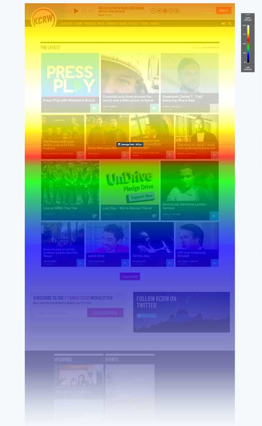
Homepage: heatmap data shows majority of users do not scroll past the fold.
Old audio player: Sits prominently locked to the top of the screen, occupying uncessary amount of space above-the-fold.
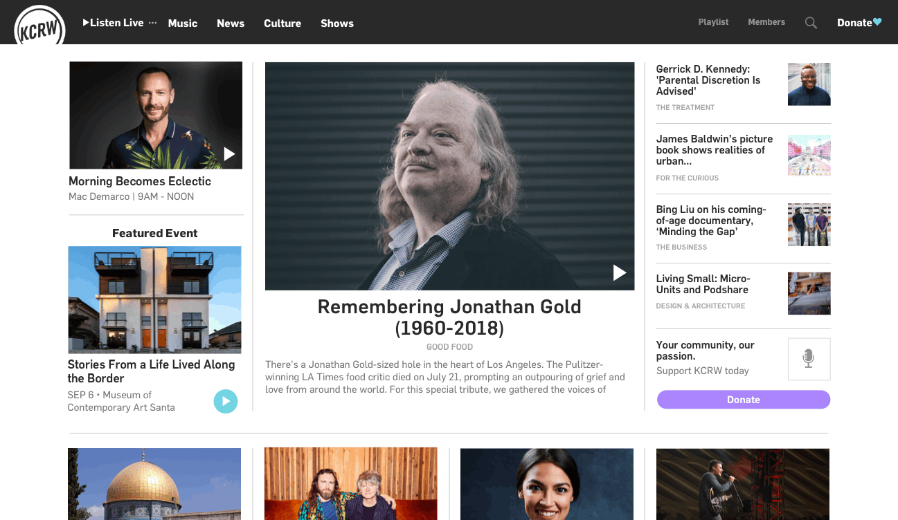
Old site navigation: Overwhelming and presenting too many options to users. Gives equal importance to all shows when that is not necessarily the case.
Moreover, in an effort increase focus to the content on the page, I chose to hide the navigation upon scroll down (and reveal it on scroll up). I would also hide the audio player by default on all pages except the homepage, so that it would be out of the way until you needed it. I chose to display it by default on the homepage since many people went there to listen to the live radio stream.
Current Navigation:

Proposed Navigation:

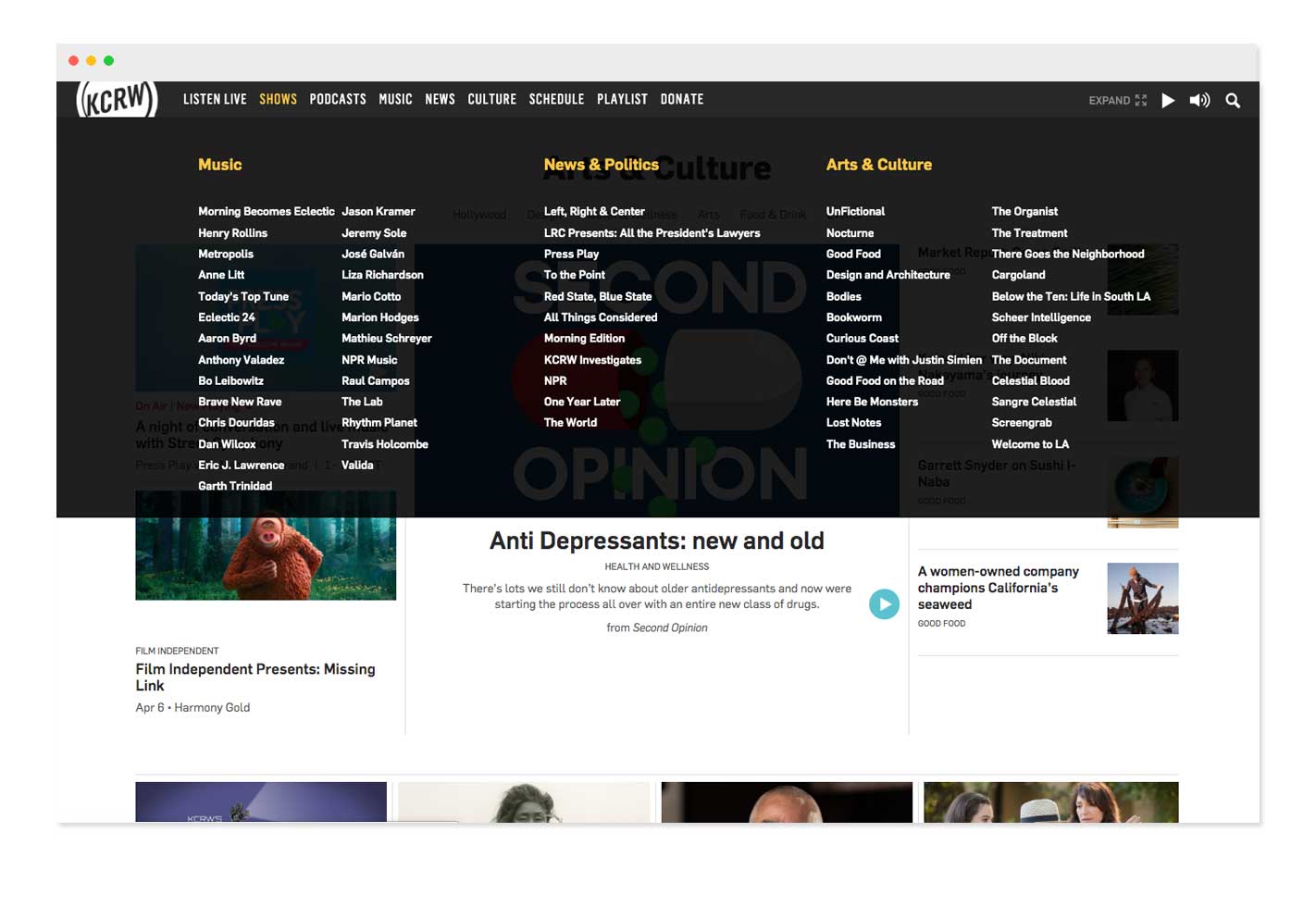
The Approach: Back to Basics
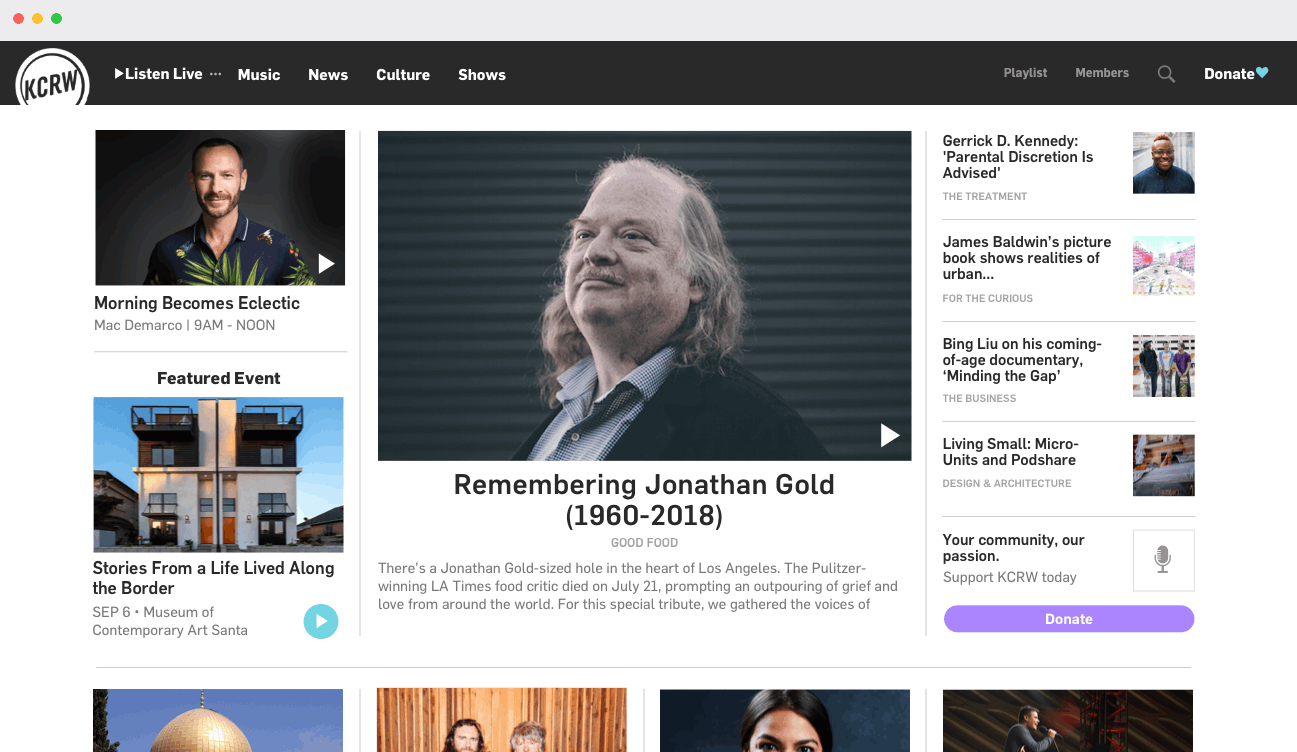
Redesigned header and navigation. Header nests alternate live streams beside "Listen Live" to keep streams accessible on every page.
With a simpler navgation I would be able to funnel users into key pages where I would feature our best content. Removing unncessary menu items would also help simplify choice for users. Taking a look at our content it made sense to separate into Music, News and Culture because those were the sections the station known for, and often marketed that way on air.
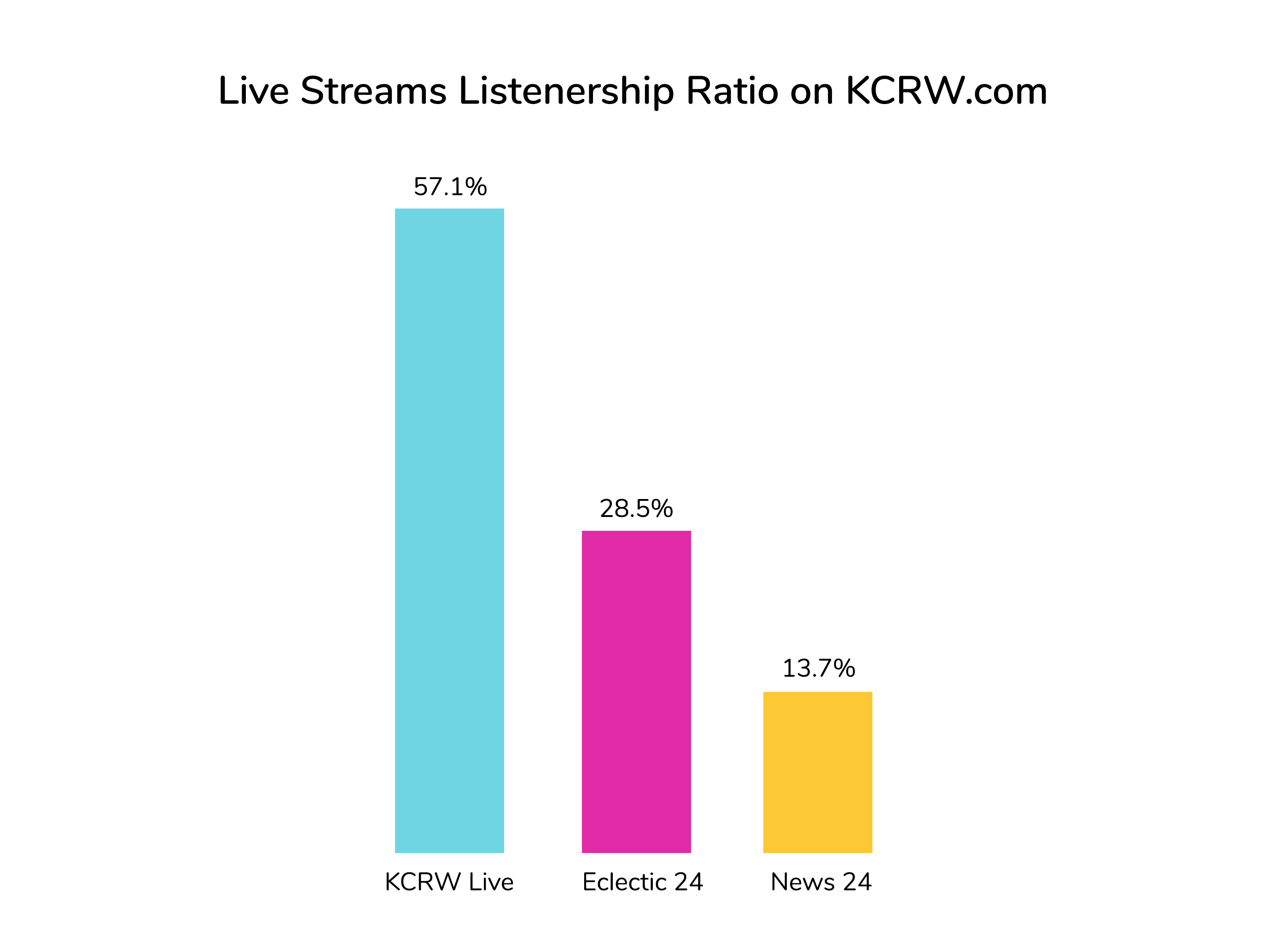
"Listen Live" would be placed first because from the data I could see that majority of users visited the site to listen to live radio online. Another challenge was that there was not only one, but 3 main radio streams that users would listen to on the site: KCRW Live (main radio stream), Eclectic 24 (24/7 music stream), and News 24 (24/7 news stream). In order to keep them accessible from every page, but not take up too much visual space in the navigation, I nested them under a "more" icon beside the "Listen Live" menu. This would funnel users into the primary stream, but give them quick access to the others. From the data I could see that stream listenership was heavy on the main stream about half drop off the following stream each.
Allowing for Focus
With the new audio player I wanted to make it accessible but as unobstrusive as possible. The current design had it ever-present and locked to the top of the screen, taking up a lot of real estate and styled in the brand's bright teal color. Moreover, the player could be opened and closed only with a small text link. Through observation I found that people sometimes had trouble figuring out how to open the menu.
With the redesign, I moved it to the bottom of the screen and only brought it into view after the user already chose to listen to something. I also made it white so it wouldn't take up as much visual space when it was open. And using a slide out animation would help people spot it more easily once they did decide to listen to something.
I also chose to add a secondary navigation for the Playlist and Schedule pages. By creating hierarchy, I'd be able to better feature the pages of discovery (Music, News, and Culture), while still giving users access to highly visited Playlist and Schedule pages.
The audio player would also allow quick toggling between live radio streams, allowing listeners to channel surf. When a show or song started playing that listeners they weren't particularly interested in, this provided a way to easily switch streams in an effort to keep them in on our site.
Another feature of the redesign was bringng out the category names alongside the content so that new users would have some context as to what topic they were listening to. This also allowed them to click through and dive deeper into a category if they wanted to hear more around the topic.
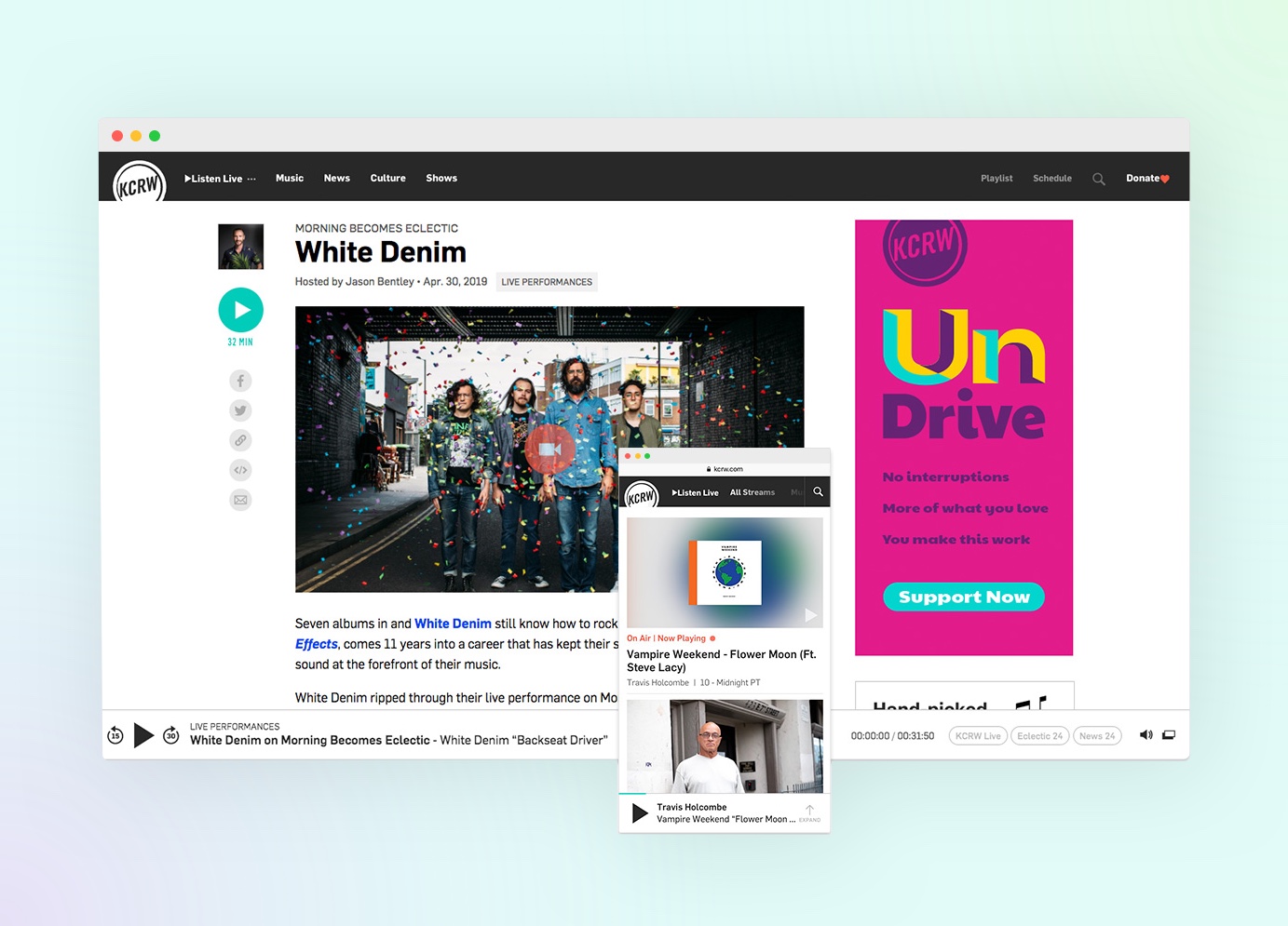
Miniplayer
Another crucial part of this project was creating a embeddable miniplayers, large and small, to match the look and feel of site. Although they would largely not be used on KCRW.com itself, it was one of the ways I could extend KCRW.com's reach around the web. Keeping the design as consistent looking as possible would help spread and reinforce the KCRW.com brand externally in an effort to bring users back to our site.
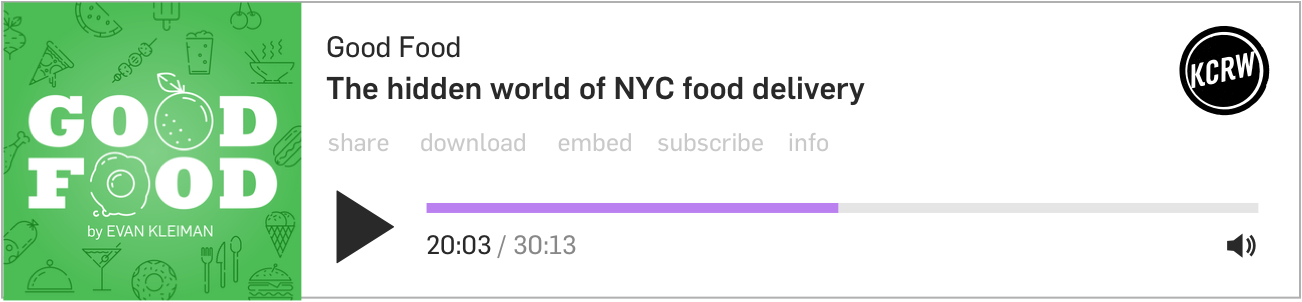
Large embed player:
Small embed player:

I created two versions, a large and a small, so that user could choose to feature one more prominently, or embed multiple smaller ones alongside in each other.