Discover Los Angeles Tourism App
I designed a complementary mobile app for the Discover Los Angeles website centered around events, hospitality and restaurant discovery in the great city of LA.
Role: UI/UX Design
Year: 2017
Client: private contractor
The Challenge
The goal for this project was to create a companion app for Los Angeles County Arts commission's Discover Los Angeles website. The site has a wealth of information for people looking to do things in LA, but did not have an a mobile experience to go along with it.
My Role
I was part of the early design team involved with ideation, user flow, wireframes, and concept designs.
The Approach: User Polling
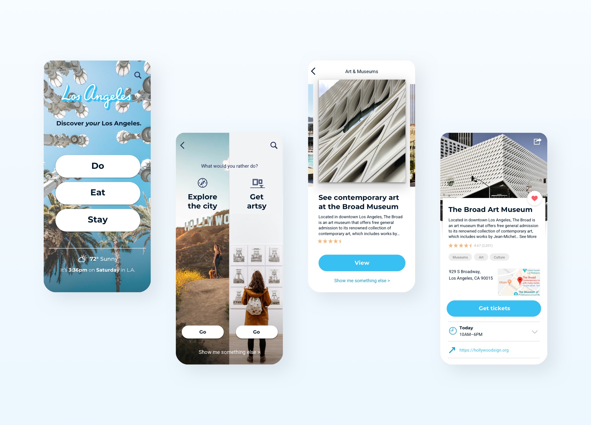
Instead of creating an app that mirrored the website, our team proposed a polling approach where users could narrow down their interests with A/B questions. All the events would be categorized under three broad categories: "Do," "Eat," and "Stay."
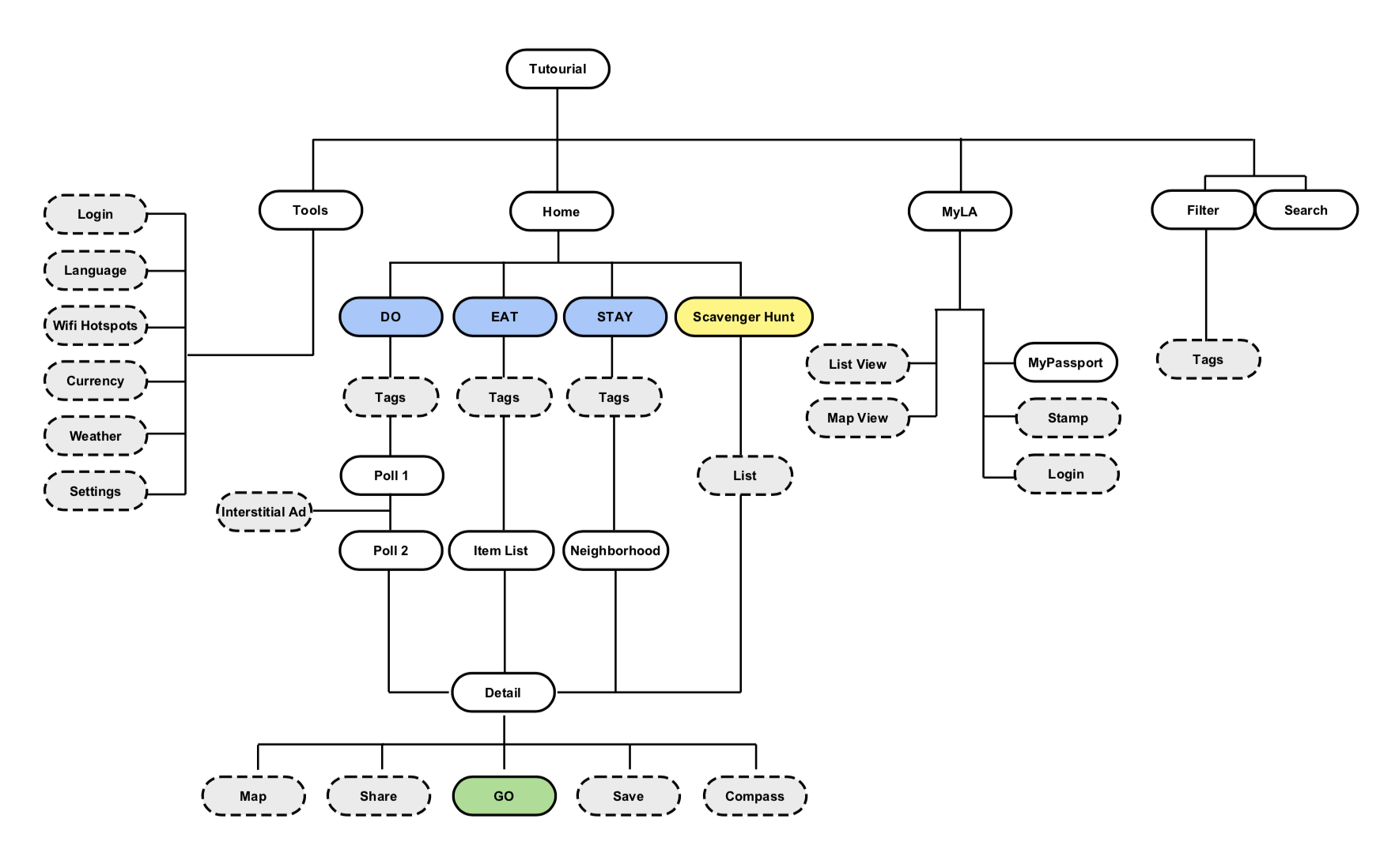
The App's Organization
After a short tutorial, users would start at the home screen and select between the 3 main sections of the app, Do, Eat, and Stay, enter the polling stage where they would select between A or B, or reload the screen with a new poll. Once they found a category of interest, they would go to the listings screen where they would flip through various cards in order to find an venue or event of interest.
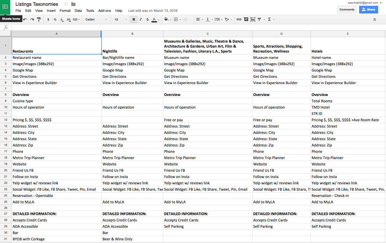
We put together a list of taxanoies that would be used to populate various fields for the listings. This would also help give the designers an idea of how much information would need to be accounted for in the designs.
All the Taxonomies
Now, the Wireframes
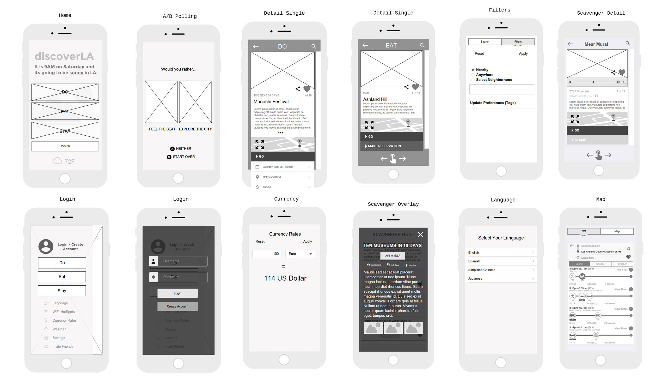
The wireframing stage really helped us get an idea for how this app would flow, and was especially helpful because they were many stakeholders involved. By getting wireframes approved separately from the concepts we could lock down the structure of the app without getting hindered by creative input.
Keys Screens / The Proposed Solution
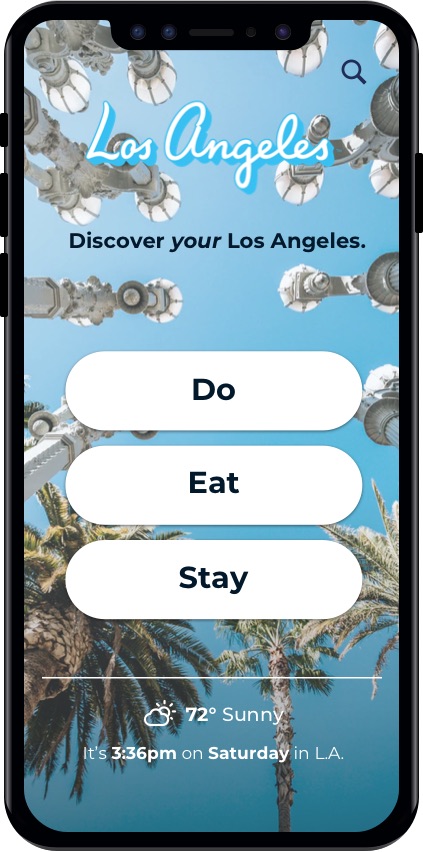
Home screen
The home screen would introduce the users to Los Angeles with a full screen background image. The current time and weather would live at the bottom so that users would be quickly reminded of the time and weather before making a decision to do something. And in the middle of the screen would be the three main actions of the design: Do, Eat, and Stay.
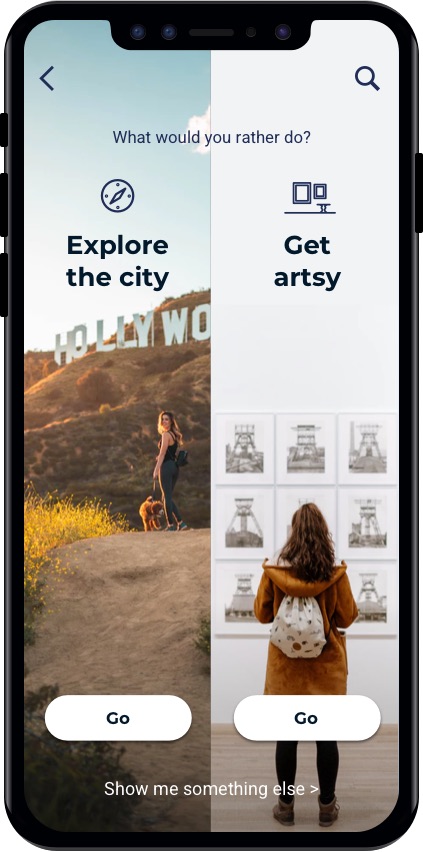
Poll screen
Once the user would select either Do, Eat, or Stay, they would be presented with a poll. In this use case, the poll is something to 'Do'. Some examples include:
- Explore the city
- Get artsy
- Go to an event
- Discover LGBT history
- DTLA happy hours
- Sci-fi movie locations
- 13 scary places
- Sip wine all day
- Sweat with celebs
- Explore Olvera street
- Grab a beer in the Arts District
- Action movie locations
- Top 10 Hollywood dates
- Discover hidden stairs
- Find your beach
- Marilyn Monroe's L.A.
- Shop speciality bookstores
- Hardcore hiking
- The must-sees
- Hardcore hiking
- K-Town hidden gems
- Romantic movie locations
- Sip the best margaritas
- Take the In-n-Out tour
Item list screen
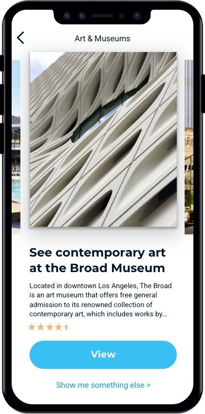
After choosing from the poll, users would get deeper into the app where they would be presented with a list of cards. Swiping left/right to go through them, or going back or tapping "Show me something else" to poll again.
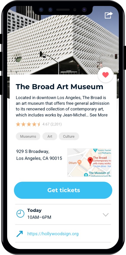
Details screen
And lastly, in this journey the user would reach the detail screen with information about the venue, including description, address, map, tickets (if applicable), hours of operation, website, park, and more.